


You are using an out of date browser. It may not display this or other websites correctly.
You should upgrade or use an alternative browser.
You should upgrade or use an alternative browser.
The Official Art thread
- Thread starter Lhorkan
- Start date
Users who are viewing this thread
Total: 2 (members: 0, guests: 2)


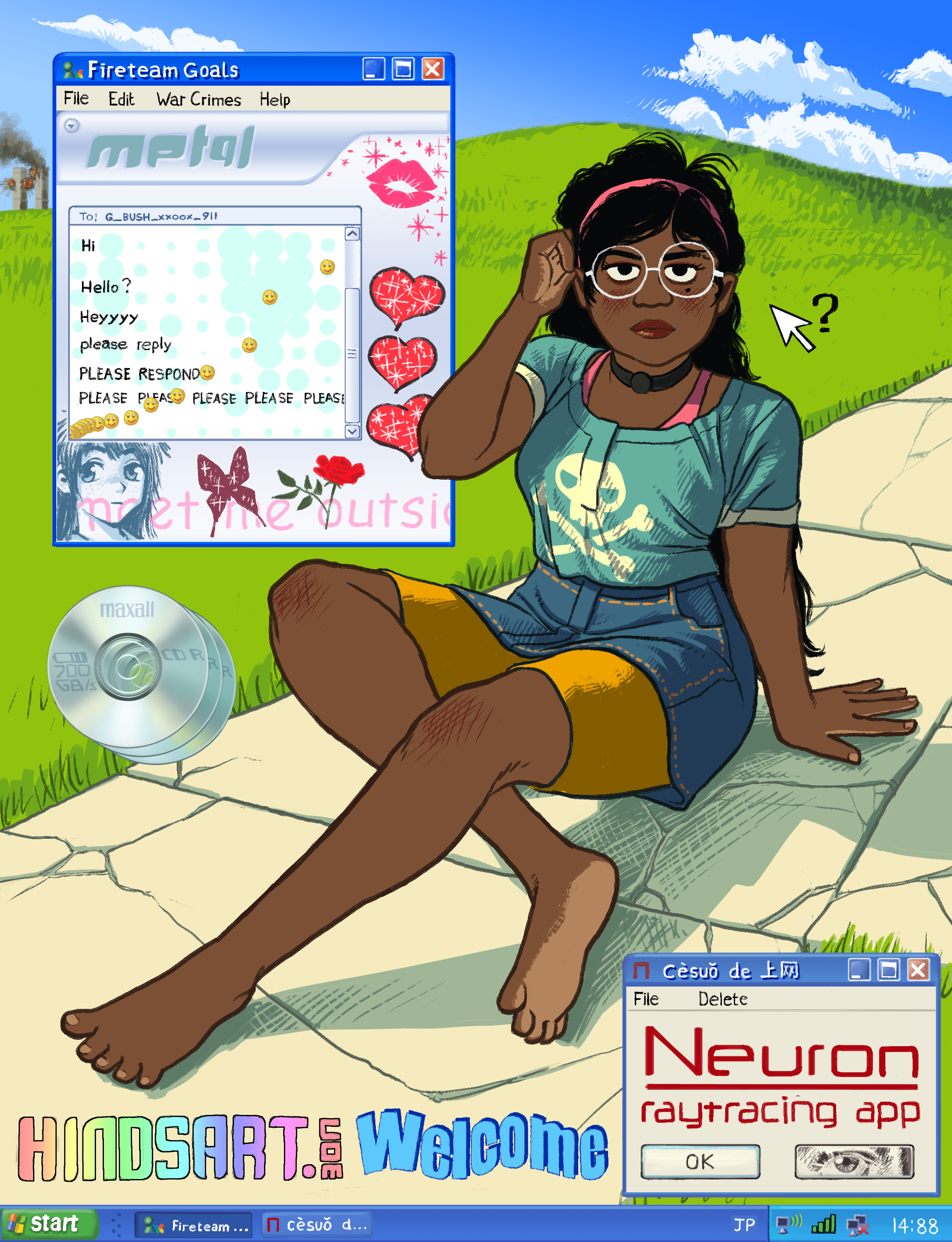
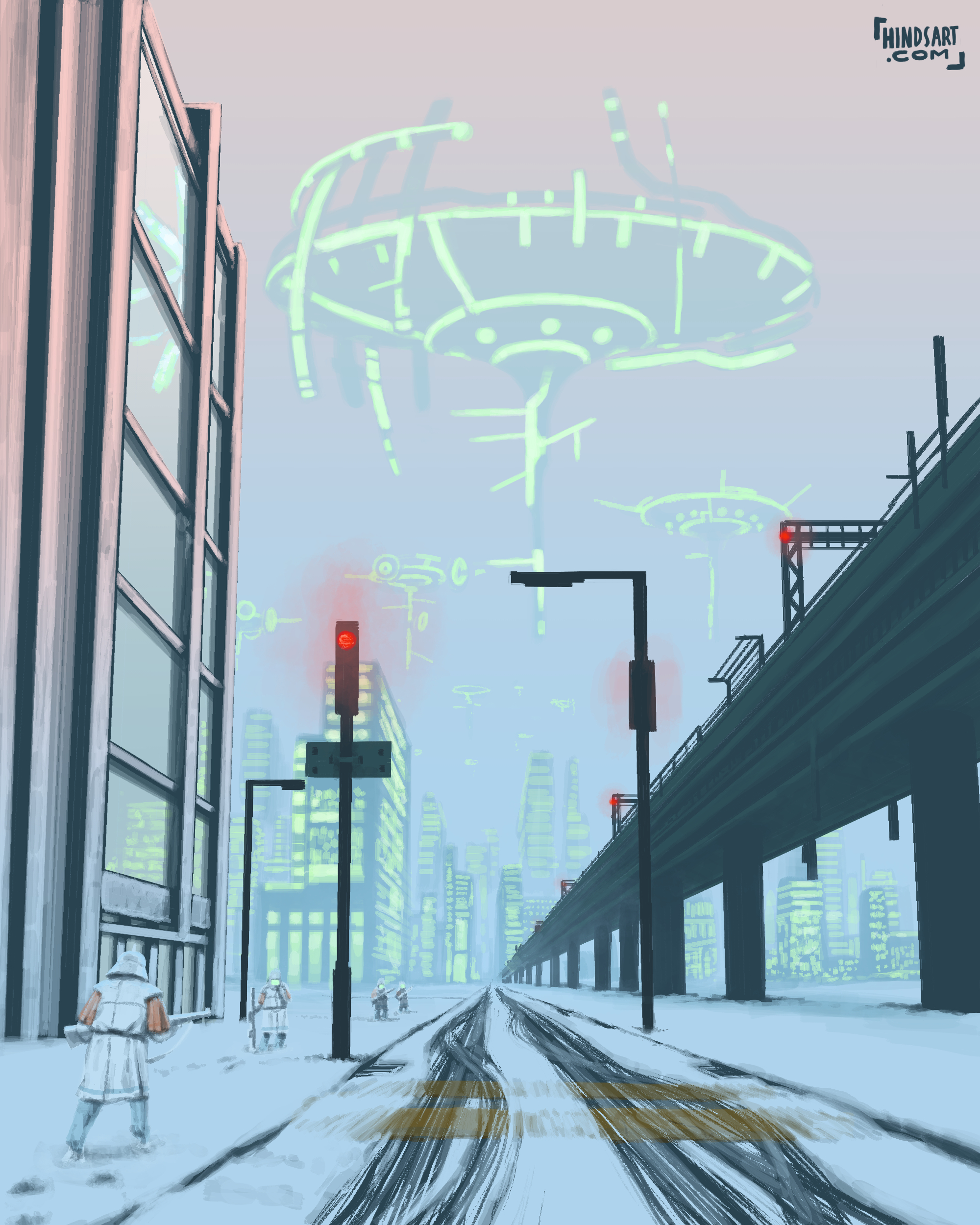
Long time no see! What's up, you reprobates?
What do you think?


What do you think?
It looks you just took a drawing/image and put a bad filter over it or you opened the image in Illustrator and used the tool that automatically vectorises rasters.
How exactly did you make that? Surely you didn’t create that effect by hand?
Not meant as an insult, I do like the movement etc and it reminds me of an old fantasy book I had as a little gashberg back in the day.
How exactly did you make that? Surely you didn’t create that effect by hand?
Not meant as an insult, I do like the movement etc and it reminds me of an old fantasy book I had as a little gashberg back in the day.
Sorry for the wait on the reply - those were my first time playing with something called adobe capture, it's a photo to vector thingamie.
I took them with my phone from my sketchbook, and just let the program do its thing, then took them back to jpegs. It's free, and I got it while I was chatting with some of my family who also does art.
I think that if I use it to mix together that with scans of the image, I could do something interesting, get both the shading that this skips over entirely and have these as the 'inked' parts that I normally suck at choosing. Here I can look at it and see if an area works as 'ink' or not, and go from there.
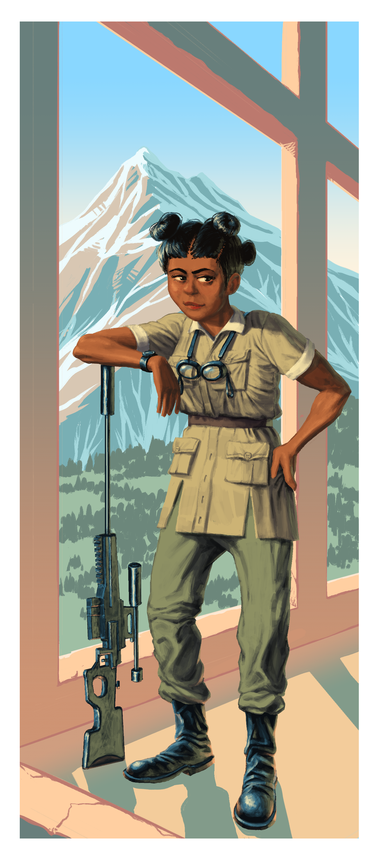
Here's a closer shot of one of the faces on the page, that also went through the 'smooth' option. I like my freaky elf lady.

I took them with my phone from my sketchbook, and just let the program do its thing, then took them back to jpegs. It's free, and I got it while I was chatting with some of my family who also does art.
I think that if I use it to mix together that with scans of the image, I could do something interesting, get both the shading that this skips over entirely and have these as the 'inked' parts that I normally suck at choosing. Here I can look at it and see if an area works as 'ink' or not, and go from there.
Here's a closer shot of one of the faces on the page, that also went through the 'smooth' option. I like my freaky elf lady.

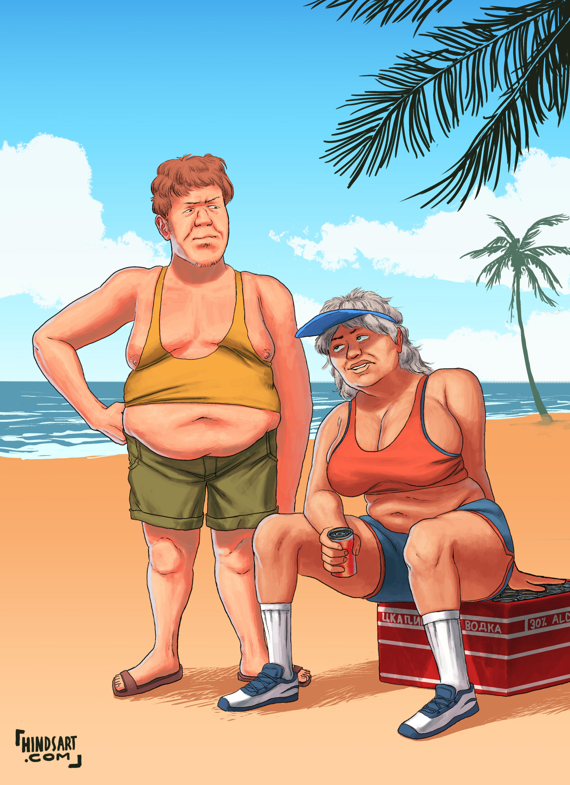
Just found two of my very old digital pieces I did for people on the Battlefield Heroes forums (a now dead game).


Note- the style of nose etc. is based on the character design of Battlefield Heroes.
Note- the style of nose etc. is based on the character design of Battlefield Heroes.

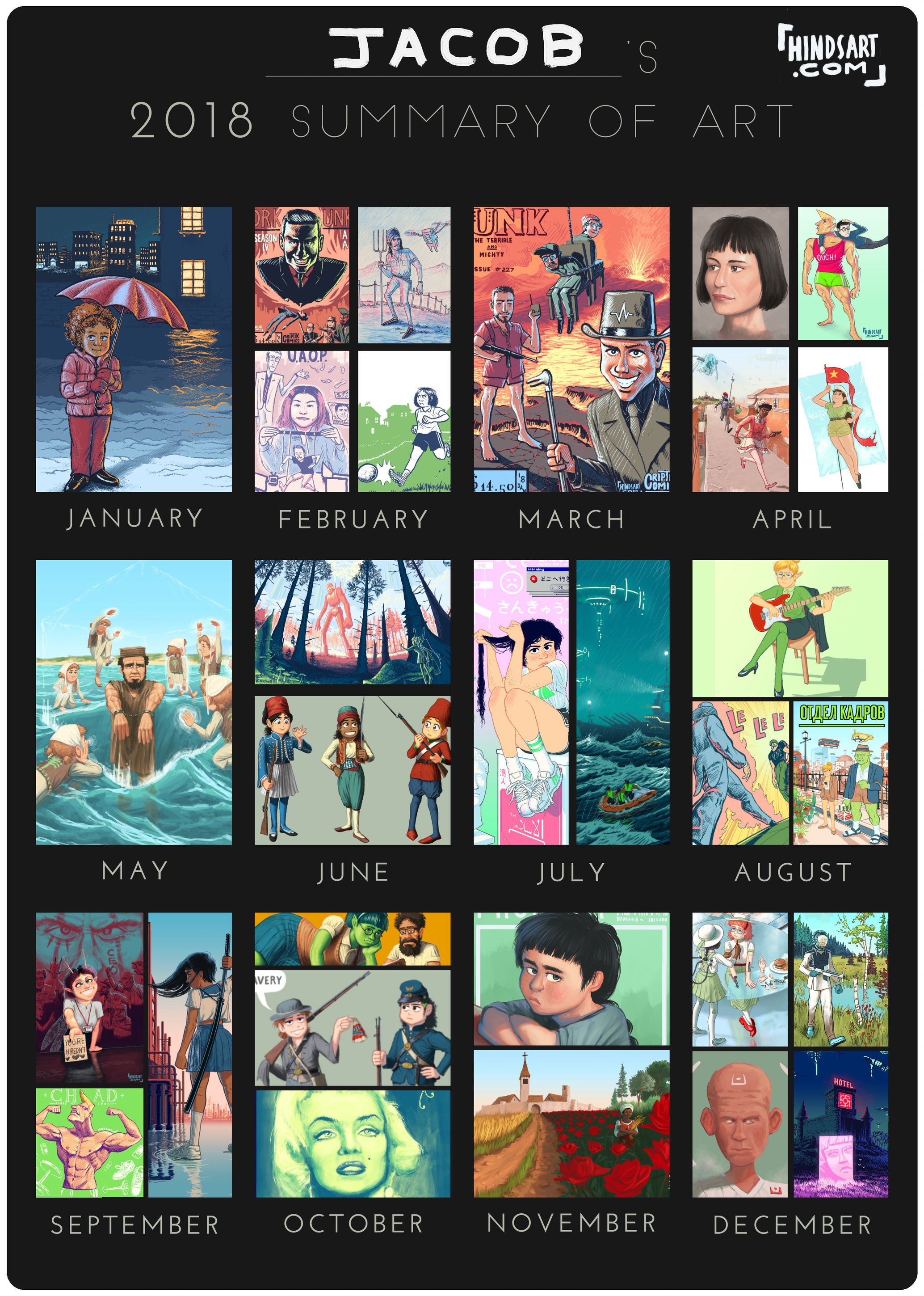
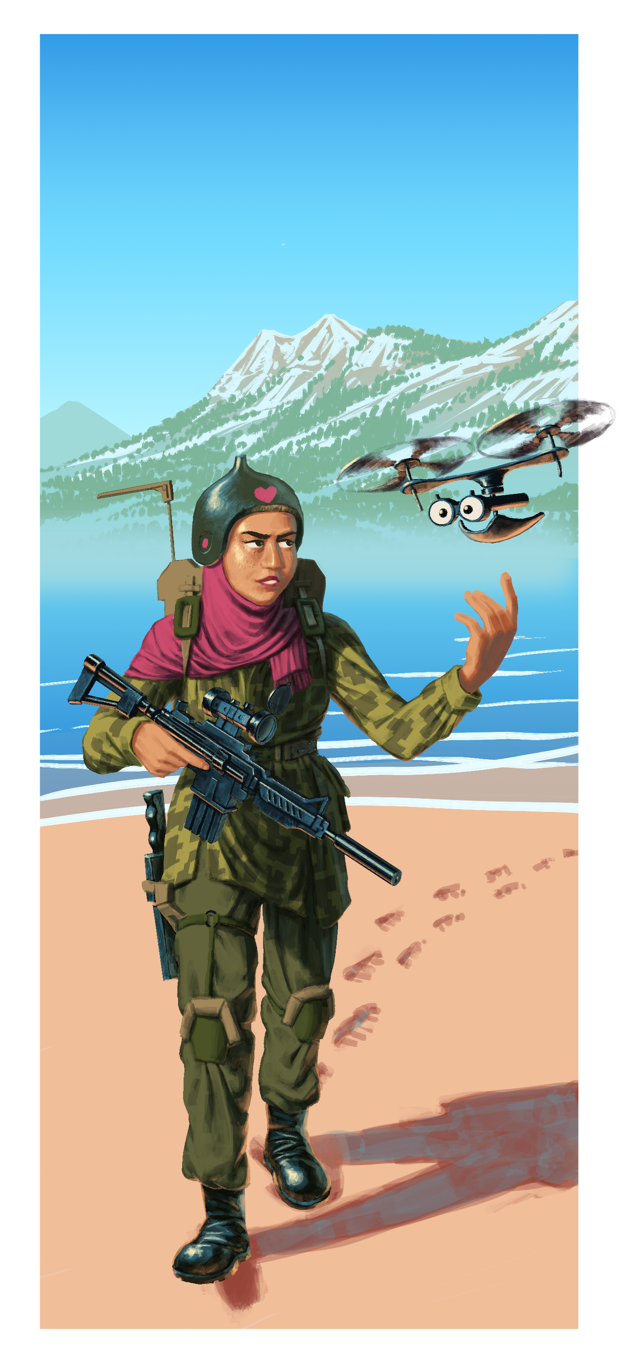
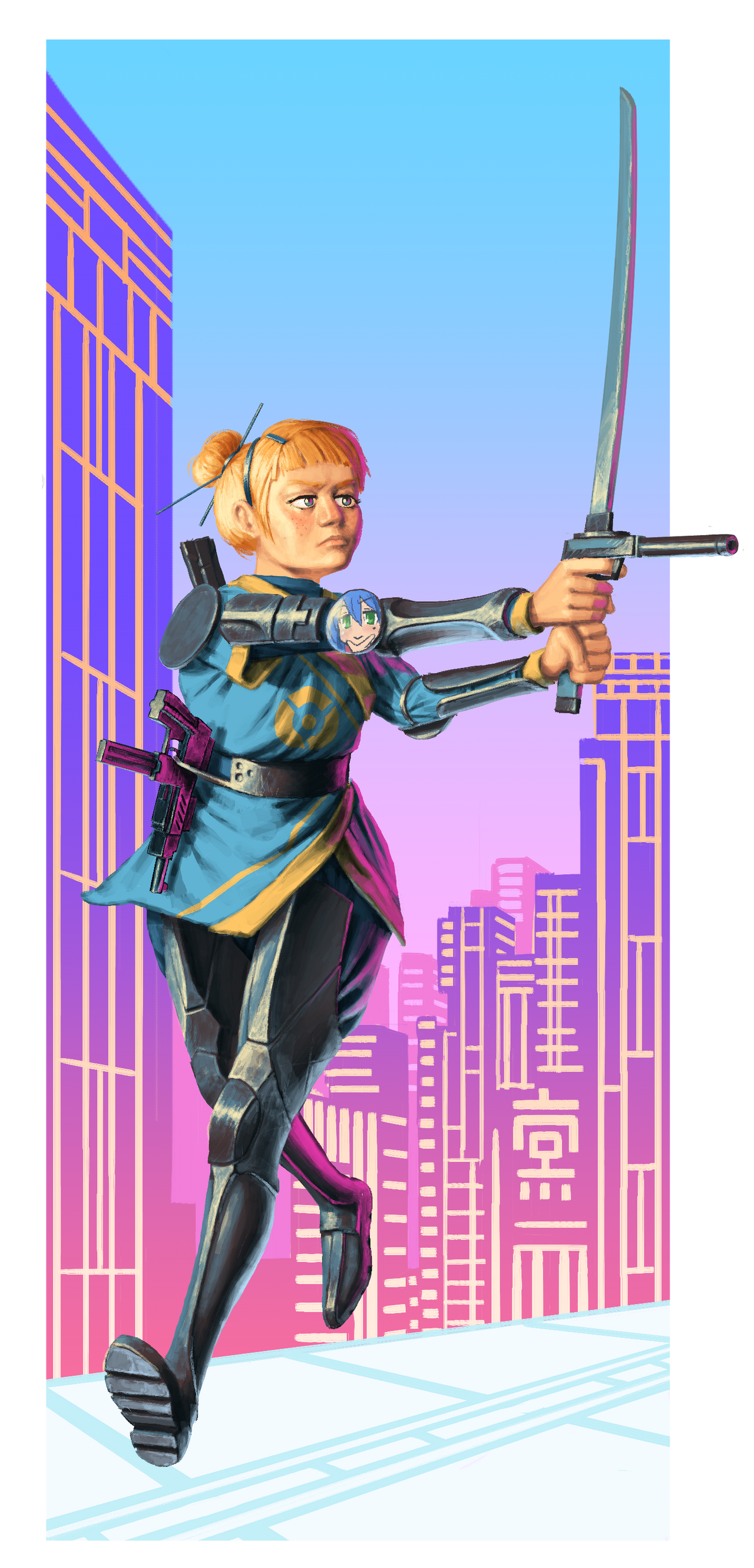
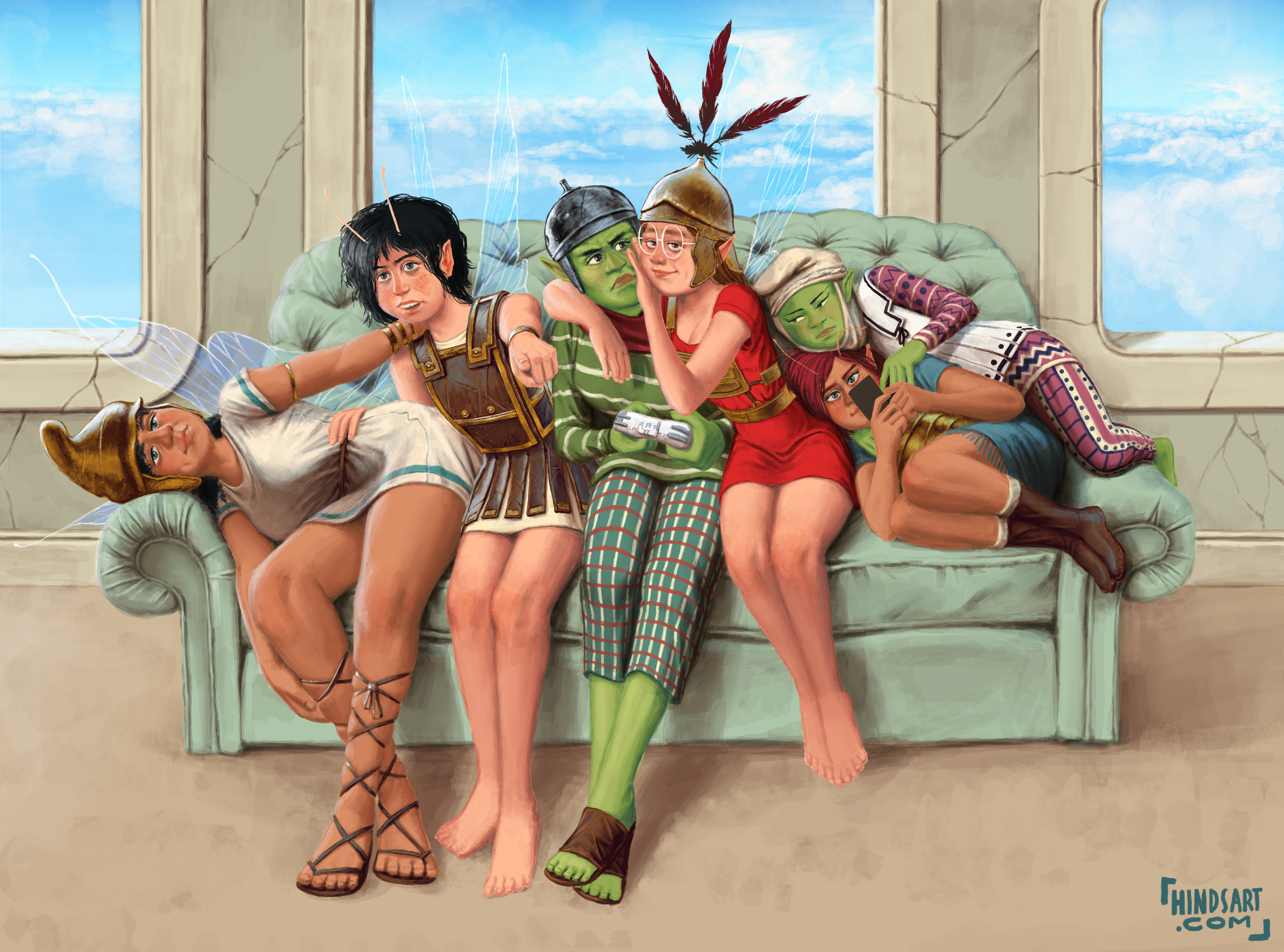
Current works in progress


I’m sick of your blatant perspective and lighting errors.
For real this time, when I get the time I’m going to go through every one of those and point out the real big errors. That one of the two painters sitting on dat table is horrifically bad.
Nice drawings though.
For real this time, when I get the time I’m going to go through every one of those and point out the real big errors. That one of the two painters sitting on dat table is horrifically bad.
Nice drawings though.
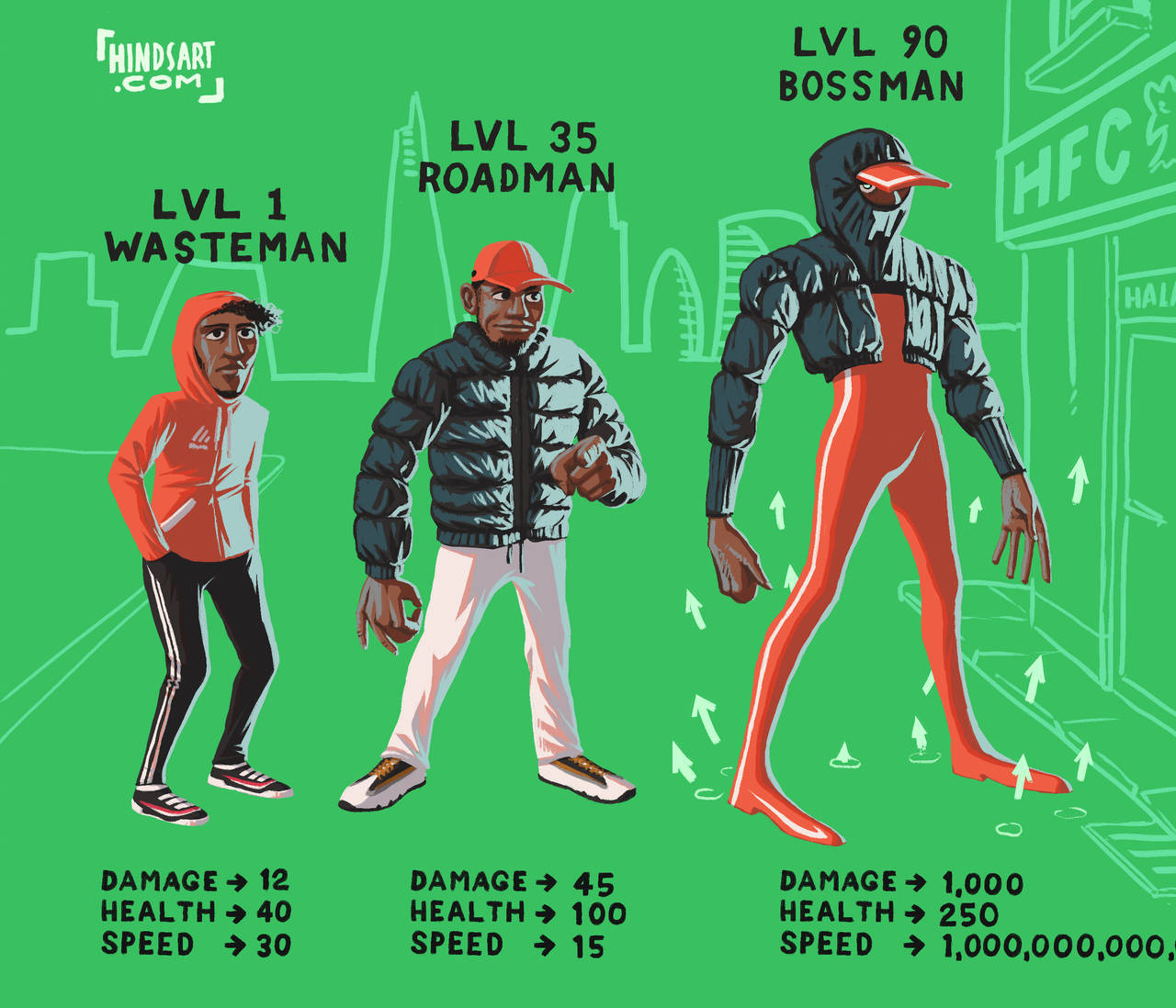
CKyHC
BIGGER Kentucky James XXL Do you have a very interesting psychedelic world, can you try drawing small comics? 
Some more drawings for my AAR:


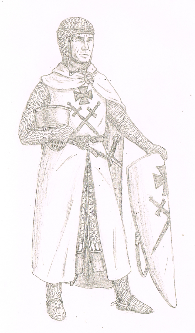
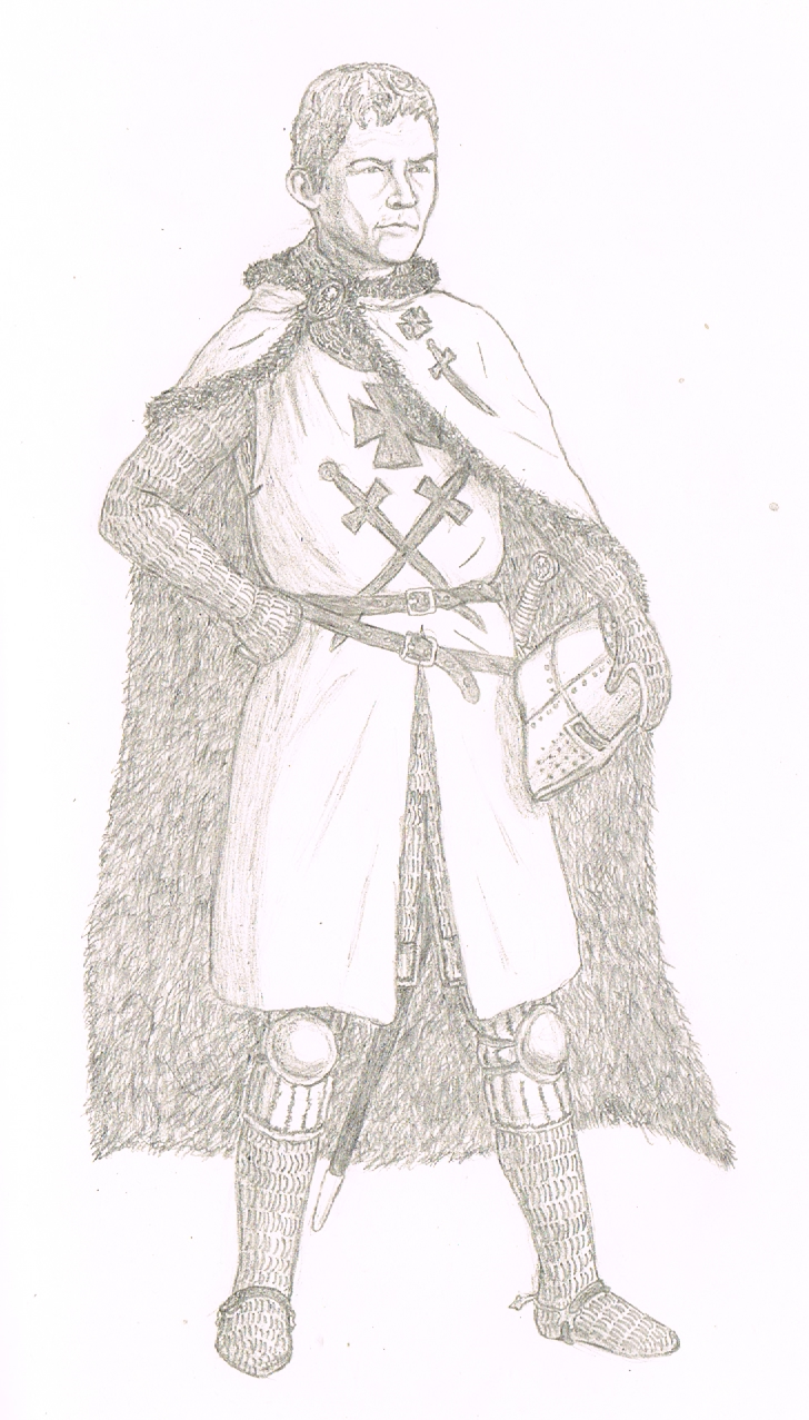
The two historical masters of the Livonian Brothers of the Sword, with their faces based on how they look in CK2 because there are literally no other depictions of them:
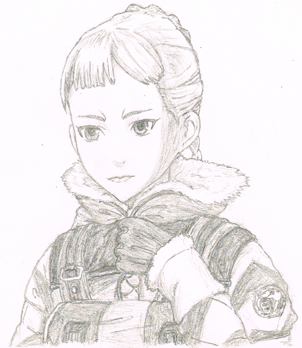
And a couple of portraits:
The two historical masters of the Livonian Brothers of the Sword, with their faces based on how they look in CK2 because there are literally no other depictions of them:
And a couple of portraits:
CKyHC
Captured Joe Knights turned out very colorful(racy)
Usually yes, but these are leaders of a military order, which had regulated and rather simple outfits.
The Swordbrothers were based on the Knights Templar and copied the overall "look" of their habits, although they were known to be much less disciplined than the other military orders!
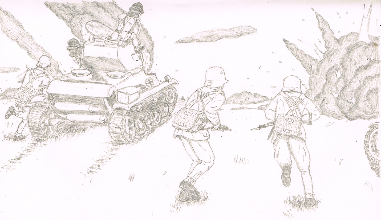
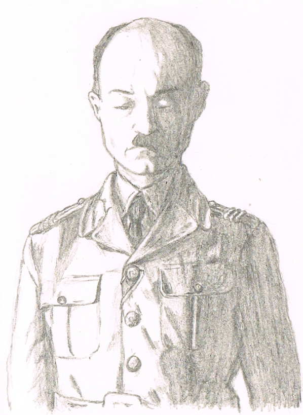
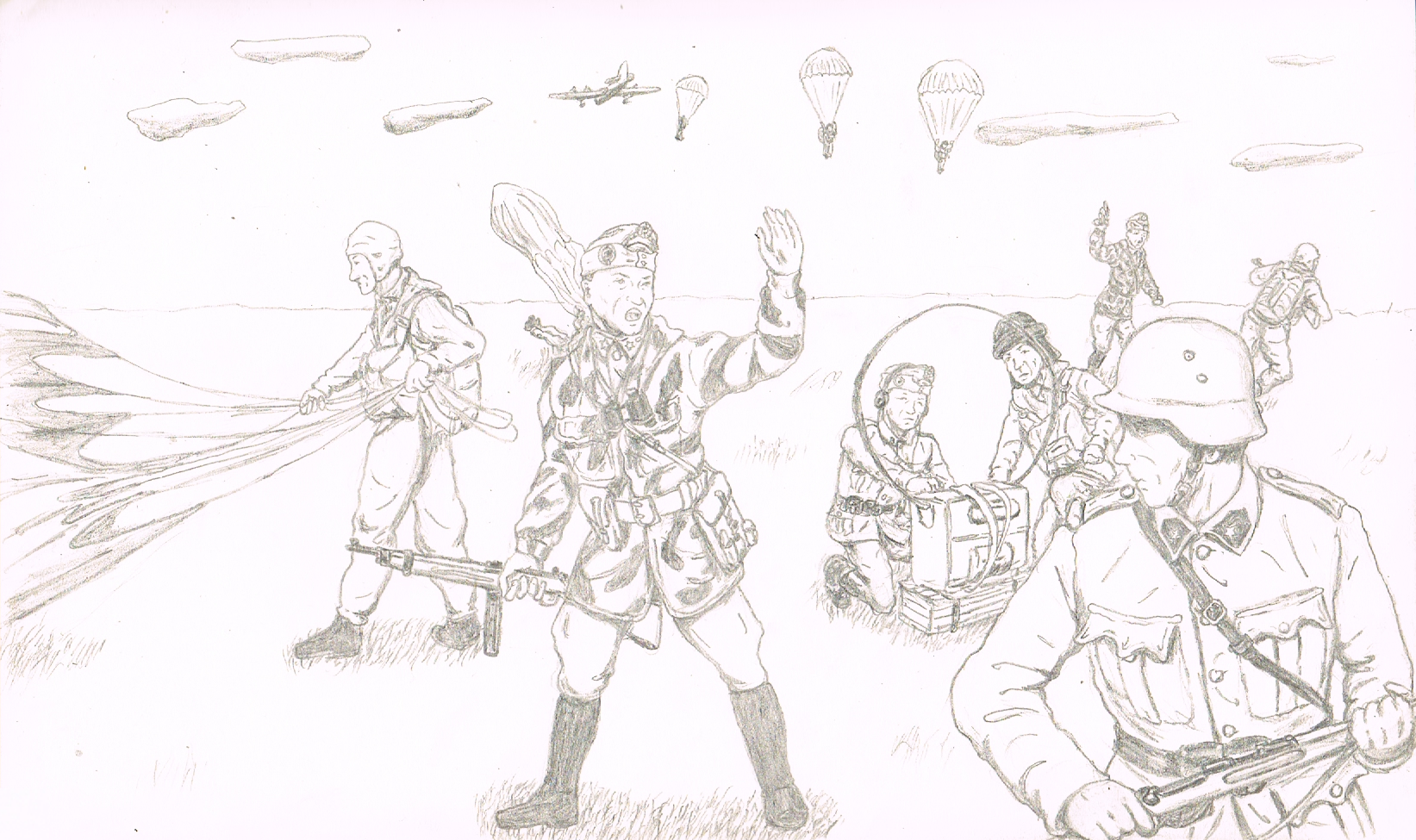
Anyway, here's some Hungarian paratroopers:
The Swordbrothers were based on the Knights Templar and copied the overall "look" of their habits, although they were known to be much less disciplined than the other military orders!
Anyway, here's some Hungarian paratroopers:

BIGGER Kentucky James XXL said:
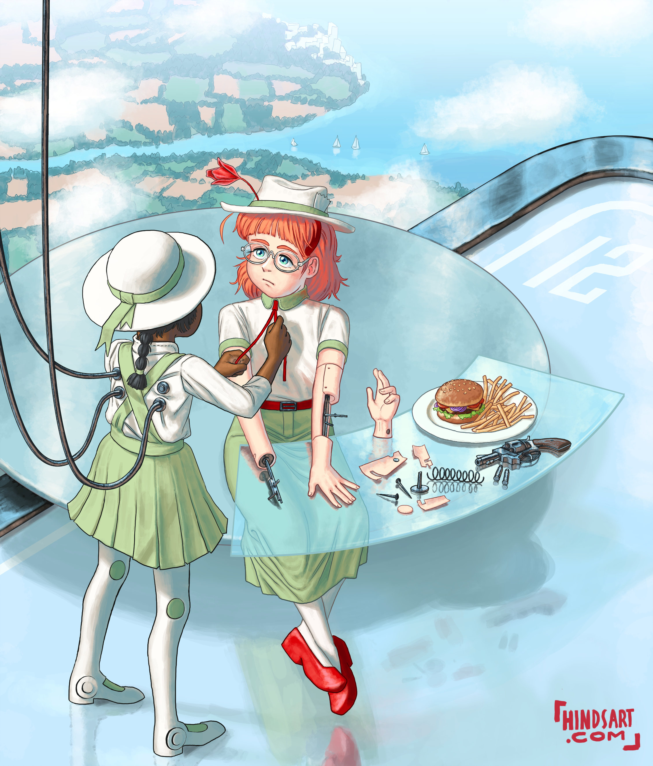
The first one of these seems to have a slight error; the android being fixed is missing a right hand yet the disembodied hand on the table is a second left hand. Or is this deliberate?...
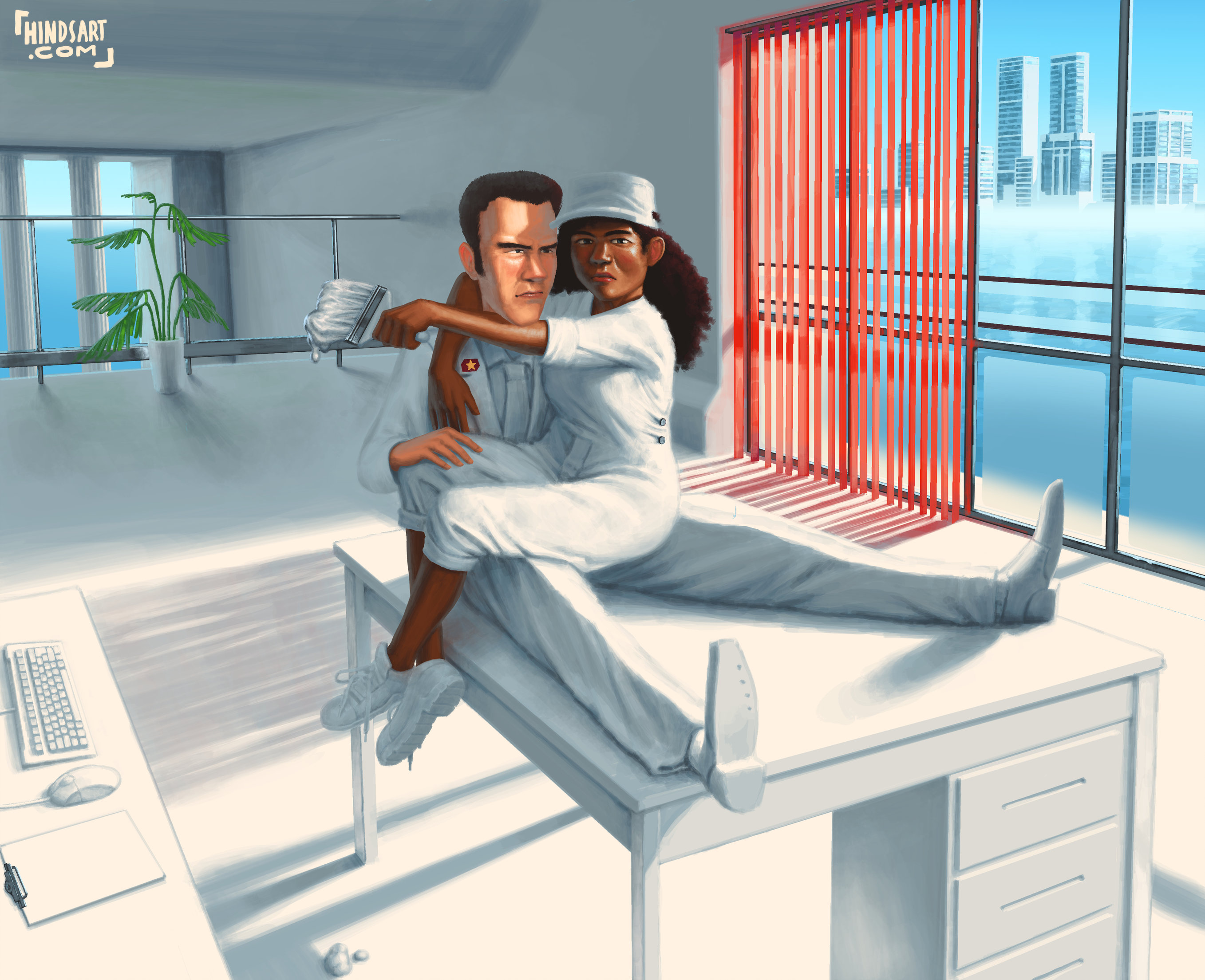
The second must surely be, conciously or not, inspired by Temujin and his reminisces of cruising around with his friend. Just look at the driver's hairline.

I noticed the mistake while still in the sketch phase and went "oh who cares, all my work is highly conceptual now anyway" and ignored it.
Maybe that's why she's getting it replaced.
Maybe that's why she's getting it replaced.
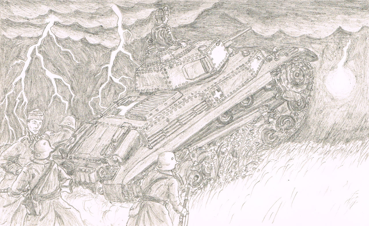

I feel like sitting on top of a gigantic piece of elevated metal while lightening strikes right beside you isn't the best idea. Unless this is another wacky Nazi wunderwaffe.
Well, it's a 40M Turán medium tank, so yes, it's definitely a Wunderwaffe. The Soviets will never see it coming.TheFlyingFishy said:Unless this is another wacky Nazi wunderwaffe.
Speaking about miracle weapons:
If you don't use pens in your next drawing I will personally be signing a petition for the UK government to nuke the Netherlands, with emphasis on the dams.
the eraser is as integral as the point you perspectiveless artman
Similar threads
- Replies
- 20
- Views
- 5K
- Replies
- 140
- Views
- 47K