Joker86
Sergeant Knight at Arms

As this is not really a bug report, I will post it here: I would suggest to change some of the helmets, as I think they don't look as great as the rest of the mod:
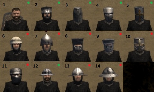
As you can see, I marked the helmets green and red, to show you which ones look right to me, and which don't.
The first line consists of helmets which look fine to me (although I don't like helmet 4, it looks somehow "too round" to me ). They are there for comparation purposes, as the second line consits of helmets I have the feeling they are too "big".
Helmet 6 for example is some kind of polstered cap you normally wear under your great helmet, right? How big is this helmet supposed to be then, if you already look like a football player with this cap?
Helmet 7 also looks just too big. Was there really so much space between the coif and the helmet? I know modern helmets have quite some space between them and your skull, so this would also make sense for a medieval helmet, but nonetheless it just looks awkward
Helmet 8 looks like some helmet from a fantasy knight of a childrens tale to me. I have seen pictures of such helmet, but the "waist" those helmets had never was that extreme, and it also looks just too big.
Helmet 9 isn't that bad, but to me it still looks to broad, and the faceplate seems to be too big. ON the other hand, the actual helmet seems to be a bit too flat, if you compare it to the other flat helmets on the picture.
Helmet 10 also is too big, and looks just awkward.
Helmet 11 is also too big, and I think here we actually have a "bug" concerning item scale. I don't know if you can see it properly on this small pic, but the collar of the coif is bigger than other coif collars, you can see it clearly if you switch to another helmet and back again.
Helmet 12 is for comparison again. I like it very much.
Helmet 13 and 14 again seems too big to me, if compared with helmet 12.
All in all I would say that a small head/helmet looks meaner and more dangerous (and thus better), while a big head makes you look like a child, a marsian or someone who has an exaggarated fear of taking a scratch. I used to draw comics, so I know
I think that you can see the wrong scale nicely on helmet 14 if you look at it in a scene:
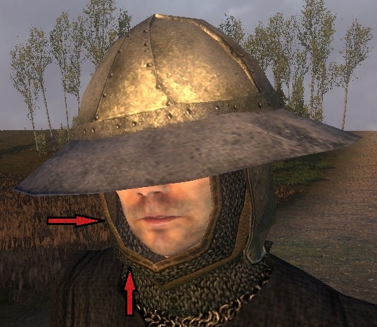
You see the space between the coif and the cheeks? I don't think this is supposed to be.
Then we have a helmet, which needs to be reworked a bit perhaps, as it severly hampers the carrier:
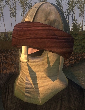
He can't see ****
There are other helmets, like the kettle helmets from above, where you also don't see the eyes from many angles (which can look badass => comic experience again ). But you should at least be able to see them from below.
Edit: and, of course, there is something wrong with the shadows on it. In inventory screen the cloth coif (?) is invisible, but if you click on the helmet and it turns to your cursor, the coif appears. (Btw.: we have the same thing with the Norman helmet with crown, I think)
And finally:
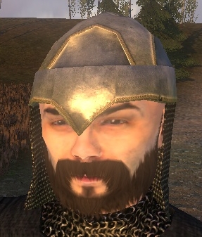
I know this helmet is historically accurate, but... does anyone else have the opinion that it looks like a fantasy helmet? It seems to fit more to a complete dwarven armour, as the design is very close to Gimli's axe.
Perhaps making the texture darker and dirtier would help a bit
As you can see, I marked the helmets green and red, to show you which ones look right to me, and which don't.
The first line consists of helmets which look fine to me (although I don't like helmet 4, it looks somehow "too round" to me
). They are there for comparation purposes, as the second line consits of helmets I have the feeling they are too "big". Helmet 6 for example is some kind of polstered cap you normally wear under your great helmet, right? How big is this helmet supposed to be then, if you already look like a football player with this cap?
Helmet 7 also looks just too big. Was there really so much space between the coif and the helmet? I know modern helmets have quite some space between them and your skull, so this would also make sense for a medieval helmet, but nonetheless it just looks awkward
Helmet 8 looks like some helmet from a fantasy knight of a childrens tale to me. I have seen pictures of such helmet, but the "waist" those helmets had never was that extreme, and it also looks just too big.
Helmet 9 isn't that bad, but to me it still looks to broad, and the faceplate seems to be too big. ON the other hand, the actual helmet seems to be a bit too flat, if you compare it to the other flat helmets on the picture.
Helmet 10 also is too big, and looks just awkward.
Helmet 11 is also too big, and I think here we actually have a "bug" concerning item scale. I don't know if you can see it properly on this small pic, but the collar of the coif is bigger than other coif collars, you can see it clearly if you switch to another helmet and back again.
Helmet 12 is for comparison again. I like it very much.
Helmet 13 and 14 again seems too big to me, if compared with helmet 12.
All in all I would say that a small head/helmet looks meaner and more dangerous (and thus better), while a big head makes you look like a child, a marsian or someone who has an exaggarated fear of taking a scratch. I used to draw comics, so I know
I think that you can see the wrong scale nicely on helmet 14 if you look at it in a scene:
You see the space between the coif and the cheeks? I don't think this is supposed to be.
Then we have a helmet, which needs to be reworked a bit perhaps, as it severly hampers the carrier:
He can't see ****
There are other helmets, like the kettle helmets from above, where you also don't see the eyes from many angles (which can look badass => comic experience again
). But you should at least be able to see them from below.Edit: and, of course, there is something wrong with the shadows on it. In inventory screen the cloth coif (?) is invisible, but if you click on the helmet and it turns to your cursor, the coif appears. (Btw.: we have the same thing with the Norman helmet with crown, I think)
And finally:
I know this helmet is historically accurate, but... does anyone else have the opinion that it looks like a fantasy helmet? It seems to fit more to a complete dwarven armour, as the design is very close to Gimli's axe.
Perhaps making the texture darker and dirtier would help a bit