


You are using an out of date browser. It may not display this or other websites correctly.
You should upgrade or use an alternative browser.
You should upgrade or use an alternative browser.
The Official Art thread
- Thread starter Lhorkan
- Start date
Users who are viewing this thread
Total: 4 (members: 0, guests: 4)


Quick thing


jacobhinds said:Quick thing
looks great ! idk why but this reminds me spirited away


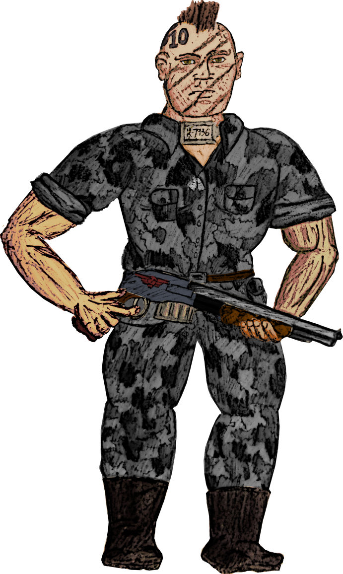
Mack is a prospect, aka, a convict soldier, who belongs to the 1st Hephaestus Hammerguard. A former hacker and burglar for hire, he would break into compounds either to steal from them or be hired by the owners themselves to find weaknesses in their own security. At some point however he was setup by rivals, and got thrown into the brig on Nokius. He quickly was picked up by the 1st Hephaestus Hammerguard, and has served with them since. He's a muscular, somewhat short individual with long arms, hailing from the ultra urban hive world of Armora V originally. He's a stealthy, strong and survivalist individual, utilizing a shotgun in combat and his basic issued knife, prospects not having much in the way of equipment; prospects having to earn their pardon and proper guardsman gear by being witnessed of becoming "Dead Hard" which equates to them being witnessed performing great acts of bravery or a stern devotion to their duty as a soldier.
Pumpkin Lord
Is that a vector art with that default sketch stroke? Looks like a style, but that stroke screws a lot, specially to the body.
Try it like 0.50
Try it like 0.50
Efe Karacar said:Is that a vector art with that default sketch stroke? Looks like a style, but that stroke screws a lot, specially to the body.
Try it like 0.50
Its just a real life sketch done with different lead pencils and photoed, uploaded to the computer with the background made transparent, and then coloured via the colourize tool and some other little settings via GIMP by lasso selecting bits and parts of it at a time.
Kinda similar to this one here:

sketch photo

coloured version

Efe Karacar said:Is that a vector art with that default sketch stroke?
I like how you're completely incorrect.
Pumpkin Lord
But, it resembles? Just look at the hands, exact kind of outcome you would expect from overdosed brush strokes in AI.
WIP

Pumpkin Lord
I liked the angle. I would make the right wall somehow more visible and I don't think gunman's perspective is ok too. Wouldn't it add to ambience if he hides his weapon totally? The tip can easily be seen with that light.
I see what you mean. The perspective is a bit messy on the woman's shoulder which ruins the entire body.
I made a couple of little changes so now the scene should make more sense.

Woman shoots man, man falls down stairs, other guy comes to see what all the blood is about, woman is about to get out of cover without seeing the other guy coming up the alleyway.
I made a couple of little changes so now the scene should make more sense.
Woman shoots man, man falls down stairs, other guy comes to see what all the blood is about, woman is about to get out of cover without seeing the other guy coming up the alleyway.
Cruor_Volt
Squire

Bad trigger discipline, tsk-tsk.
Pumpkin Lord
Here is a security footage for the perspective I am talking about. Obviously your angle is even more upper (Err, grammar). You know.
https://encrypted-tbn3.gstatic.com/images?q=tbn:ANd9GcT2CPCQ8xl0w-PxJ9HmDMvamTVFA3C5z2Kb2Yd33nN4XNc7dR3E
(Writing from phone. Not the best image)
Your angle is even at more top, which walls should almost cover gunman's head and a little rotated so we can see him from little top as angle promises.
Yea, blood explains everything now.
jacobhinds said:I see what you mean. The perspective is a bit messy
Not bad on the two-point perspective front. The characters (and the guns) need some work to look less flat, but the major perspective issue that stood out to me was the window. I made a hugely patronising image to show you what I mean. It's a little messy with all those perspective lines, but focus on the yellow ones. They need to match the two main vanishing points you've set up.
Open in new window cus dank Taleworlds resizes it!!!
http://i.imgur.com/i3JhqFN.png
Some Napoleonic Light Infantrymen:
 I wonder whether I made it clear enough who is from what army
Age of Empires II: The Densetsu said:jacobhinds said:I see what you mean. The perspective is a bit messy
Not bad on the two-point perspective front. The characters (and the guns) need some work to look less flat, but the major perspective issue that stood out to me was the window. I made a hugely patronising image to show you what I mean. It's a little messy with all those perspective lines, but focus on the yellow ones. They need to match the two main vanishing points you've set up.
Open in new window cus dank Taleworlds resizes it!!!
http://i.imgur.com/i3JhqFN.png
U r rite, I didn't even notice the wall thickness dichotomy there either. All nice easy fixes but that's why we post WIPs aye.
Captured Joe said:Some Napoleonic Light Infantrymen:
I wonder whether I made it clear enough who is from what army
Nice! From the shakos and little details in the uniforms, you might make out whic army are they from, but colour would help greatly, too. Also, there seems to be another one on the right, where's he?
whatAntonis said:Also, there seems to be another one on the right, where's he?
Similar threads
- Replies
- 20
- Views
- 5K
- Replies
- 140
- Views
- 47K