Nightblade+--
Knight at Arms

I decided to open this thread instead of cluttering up Rate the above forumite's avatar.
Come here to admire our artists handiwork , or request a touchup to your avatar.
Completed avatars will be posted here at the main page as a gallery in spoiler form.
Post your requests in this thread. That's the reason it's here.
Comparisons will be posted, but completed avatars will be PM'ed to your account.
Avatars will be PM'ed in "png." format. This keeps the highest quality.
It is highly recommend you keep it in png. format.
Three guidelines for requests:
[list type=decimal]
[*]Post a link to the largest version you have of that image, with your request.
[*]Provide the image as it currently appears on the forum
[*]Be patient, art takes time and so do avatars.
[/list]
EDIT: Updated.
Notice: Will include portfolio of all artist's work soon.
Come here to admire our artists handiwork
, or request a touchup to your avatar.Completed avatars will be posted here at the main page as a gallery in spoiler form.
Post your requests in this thread. That's the reason it's here.
Comparisons will be posted, but completed avatars will be PM'ed to your account.
Avatars will be PM'ed in "png." format. This keeps the highest quality.
It is highly recommend you keep it in png. format.
Three guidelines for requests:
[list type=decimal]
[*]Post a link to the largest version you have of that image, with your request.
[*]Provide the image as it currently appears on the forum
[*]Be patient, art takes time and so do avatars.
[/list]
----------------------------------------------------------------------------------------------------------
*****************
Gallery
*****************
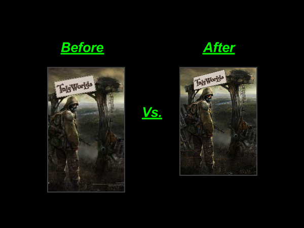
An example...
You will notice the frame on the right is clearer defined and it's colours appear more vivid. This becomes especially apparent if you save the image to your desktop, open it with Paint.net and compare while zoomed in.
It just looks more spiffy!
You will notice the frame on the right is clearer defined and it's colours appear more vivid. This becomes especially apparent if you save the image to your desktop, open it with Paint.net and compare while zoomed in.
It just looks more spiffy!
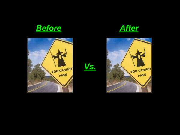
That's way better! Do a comparison like I did if you don't believe me.
Here, tell me you can't see a difference:
This is my favourite so far. You can clearly see the background. Pay special attention to the river, trees and clouds.
What a great view.
Here, tell me you can't see a difference:
This is my favourite so far. You can clearly see the background. Pay special attention to the river, trees and clouds.
What a great view.
Here you go, compare...
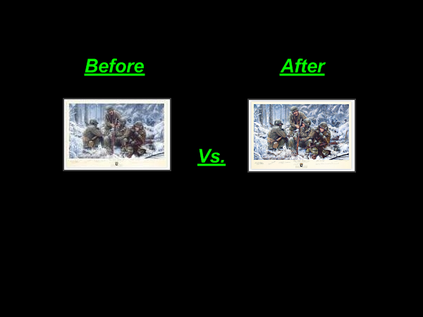
You'll notice a significant decrease in blur and a much crispier and emotive shot.
A good example is the soldier on the far left.
In the left frame his face appears completely covered, in the right frame you can see a small slit is open.
Also (though difficult to see) you can sight the soldiers in the upper right-hand background.
Hope you like it.
10/5!
Behold the Reaper's refreshed wrath!...
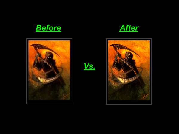
Definitely more vivid and a much crisper image. Now shoo! Go scare n00bs!
Definitely more vivid and a much crisper image. Now shoo! Go scare n00bs!
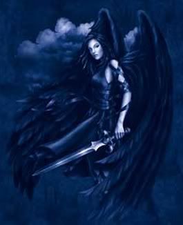
A clearer Angel...
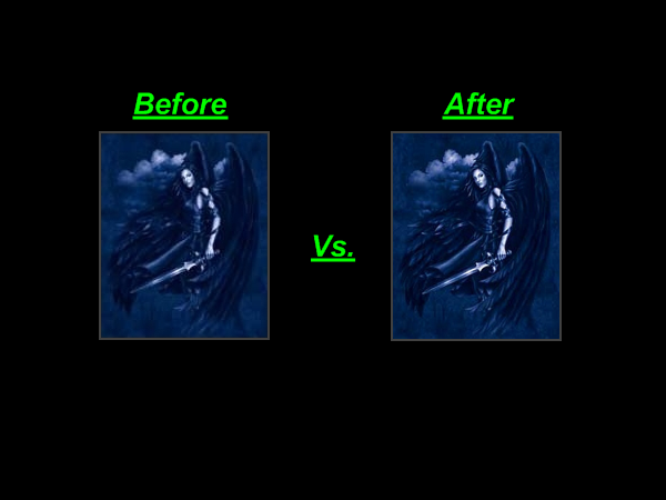
It was tricky to find the right balance between lines and that natural glowy mist, but I think you'll be satisfied with the result.
Most noticeably, her face is no longer scrunched up at the chin and her swords look like they've been near the smithy recently.
Wings and clouds also a bit more "present".
Relax!...
Bulle, you're nuts if you think I can find a more relaxing pic than this...

That bed looks comfy, lot more background detail and you can even see his whiskers.
Also no more ugly light orange text in the corners.
Let me know if you think I overdid anything.
Bulle, you're nuts if you think I can find a more relaxing pic than this...
That bed looks comfy, lot more background detail and you can even see his whiskers.
Also no more ugly light orange text in the corners.
Let me know if you think I overdid anything.
Baby red...
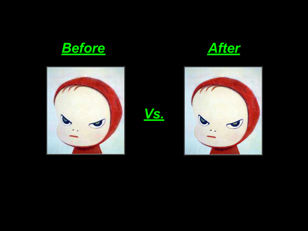
I don't like the look of this. And now I like it even less. Why? He looks more evil.
I don't like the look of this. And now I like it even less. Why? He looks more evil.
Riker's shot...
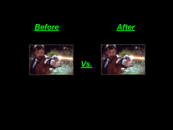
A simple but worthwhile change. Although there is another version.
A simple but worthwhile change. Although there is another version.
EDIT: Updated.
Notice: Will include portfolio of all artist's work soon.