


[parsehtml]<p><img class="frame" src="https://www.taleworlds.com/Images/News/blog_post_65_taleworldswebsite.jpg" alt="" width="575" height="290" /></p>
<p>In the medieval world, castles and strongholds were not meant to be dwellings, but military tools that were strong and easy to defend, positioned in choke points to protect an important region or trade route. Villages, on the other hand, were the population centres - places where people would dwell and sleep after a long day of work in the fields or herding their cattle. Towns were somewhat a combination of the two, but they were also very different (and complex) places. They had walls for defence and a high population count, but they were much more than just dwellings and defensive structures: they were the most important places around. Towns are where kingdoms forged their real power. Artisans worked raw materials into quality goods and merchants turned them into wealth. Courts were established in towns, so they were also the heart and brains of any realm -- where politics, conspiracies, and plots took place.</p></br> [/parsehtml]Read more at: http://www.taleworlds.com/en/Games/Bannerlord/Blog/85
You are using an out of date browser. It may not display this or other websites correctly.
You should upgrade or use an alternative browser.
You should upgrade or use an alternative browser.
Dev Blog 08/11/18
- Thread starter Callum
- Start date
Users who are viewing this thread
Total: 2 (members: 0, guests: 2)

Name said:Don't worry, guys. The models may not look amazing now, but the game's got three more years before it releases, so I'm sure it'll be fixed by then.
I hereby quote this message for truth.

I have mixed feelings about the blog, while overall I liked everything covered in this blog I, like others, have noticed certain issues with the models. The quantity of screenshots was nice and I'm sure many people will have appreciated that, and it's nice to see that barricades and defences will be erected inside towns under siege.
It what also nice to hear about how the layout of a town has been changed to be more immersive. It had been touched upon in the past but it's still good to hear about more areas in a town.
I'm guessing certain actions inside a town can only be done in person on the streets. Not that I have a problem with that. Whatever the case may be I'm still happy with this blog and I'm still eager to see what is to come.

BIGGER Kentucky James XXL said:*stuff*
I don't know, I think it looks fine. You're just nitpicking unnecessarily. Keep up the good work guys. Love the blog!
Looks FANTASTIC !
Immersion is SO important.
If the enemy break into the city, will commoners throw debris from the building tops ??? General Pyrrhus was killed by a thrown Tile. To see towns-folk ,armed with fire brands / large clubs etc etc fighting invaders would be soooooo cooooooolll
.
Immersion is SO important.
If the enemy break into the city, will commoners throw debris from the building tops ??? General Pyrrhus was killed by a thrown Tile. To see towns-folk ,armed with fire brands / large clubs etc etc fighting invaders would be soooooo cooooooolll
.
JuanNieve said:I wonder how the reinforcements will work during a siege. Maybe, if an ally army is near to the city may appear on the battlefield after a while and spawn behind the enemy lines like gandalf XD
Creatures of CHAOS should never be armed with PIKES ! This is the weapon of organised societies.
.


BIGGER Kentucky James XXL said:I had a closer look at the screenshots (with another 3d modeller friend) and there are some very bad signs.

Look at the closest building. It's flat, essentially a fake building. Warband had these, but they were confined to the very edges of scenes. Unless this is just a mocked up scene for the blog only, it means this image is just window dressing and doesn't represent what the towns are going to be like up close.
What's more, there isn't enough space between buildings to fit a proper street system (with the exception of a very narrow street leading from the right side of the image to the castle, and they seem placed so that we see the front of them rather than to face the streets they're supposedly on. The trees are floating throughout the scene, and clipping with the building under the conveniently placed bannerlord logo.

This is a little hard to spot if you're not a 3d modeller, but the "normals" on the towers are messed up, meaning the lighting is broken. They're messed up in a specific way which can only be present if they've chosen to model the tree trunks at the corner of the tower. Why they decided to do this is beyond me. It adds nothing to the icon since it's not even a pixel wide, but makes it far higher poly than it needs to be. What's frustrating is that this would be a 2-3 minute fix, and is something 3d artists are trained to spot from day one.


Is this a warband texture? Where's the normalmap, seeing as the warband version didn't have one (or didn't have a good one, iirc?)? Is that warband ivy, too? Why reuse these textures which clearly aren't designed for PBR?
I love you guys and sorry for the hakarets and başarılar to you all but please guys i mean come on. Kemal would be spinning in his grave (he's a 3d modeller now, i hear)
it's likely the view in the first screenshot is something you'll be able to see in game, but not an area you can technically access. it would be kind of ridiculous to have an entire city of that scope emulated in-game, but the illusion of such extreme depth does not preclude depth in the scenes themselves. videos of towns have been, so far, fairly promising iirc, but we'll have to see. as for texture (and model) re-use, that's definitely happening, but I'm not sure how prevalent it will be. you can still make Warband look pretty with its weaker assets, but that tends not to show very well in screenshots, as opposed to gameplay in motion (unless it's set up very particularly for the former). think about how often you see something beautiful in real life where your phone camera rarely seems to do it justice.
The problem with the textures is that they don't have good normalmaps, since they are essentially photographs. They were included into the game around 10 years ago using graphical techniques that are incompatible with the system they say they're using in bannerlord (PBR). You could get away with not having good normalmaps in 2008, but not in 2018. Even pixel indie platformers are using PBR now. The very presense of this texture is a really bad sign.
A possible explanation somebody pointed out to me is that they're not using PBR for the environments, which would explain why the engine trailer from 3+ years ago looked so much better than this, and why the foliage and landscape in the recent gamescom videos look more or less like warband.
I'd much rather the entire game look outdated than only portions of it. Nothing is worse than artistic inconsistency. Some of those scenes are outright ugly while others are fairly decent. This seems to be an issue with character design too: the artist we heard from last week said she just used random ideas from games and films rather than from actual concept art. If they have an art director he or she is not doing their job. And if they don't have an art director, especially for a game of this scope, well...GG

BIGGER Kentucky James XXL said:The problem with the textures is that they don't have good normalmaps, since they are essentially photographs. They were included into the game around 10 years ago using graphical techniques that are incompatible with the system they say they're using in bannerlord (PBR). You could get away with not having good normalmaps in 2008, but not in 2018. Even pixel indie platformers are using PBR now. The very presense of this texture is a really bad sign.
A possible explanation somebody pointed out to me is that they're not using PBR for the environments, which would explain why the engine trailer from 3+ years ago looked so much better than this, and why the foliage and landscape in the recent gamescom videos look more or less like warband.
I’m unfamiliar with physical based rendering (PBR), but the old engine power blog showed that tessellation only added enhanced surface geometry at close range for performance optimisation. Most of the screen shots under discussion are long range. Much as I like scenery, I prefer to retain sufficient processing power for larger battles, which during sieges will take place in towns with the same buildings we’re looking at.
https://www.taleworlds.com/en/Games/Bannerlord/Blog/9
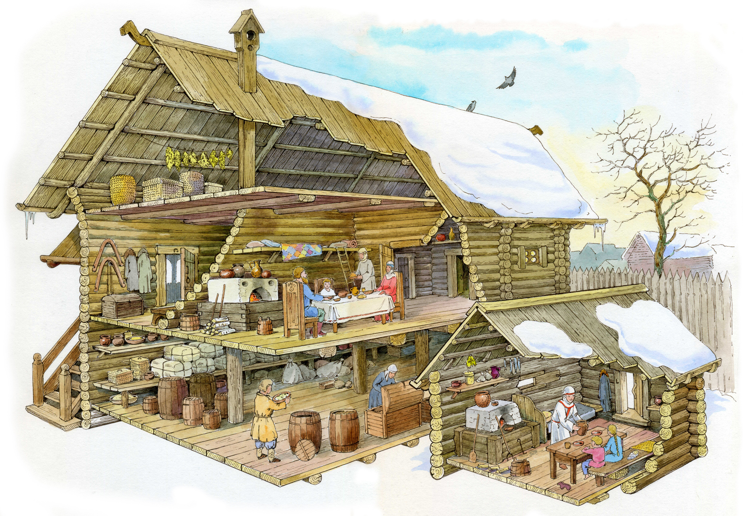
One friend of the Russian artist (Mikhail Ivanov) is now drawing reconstruction of the houses of Veliky Novgorod 13th century.
I want to show you a couple of his drawings, all of a sudden it will come in handy for you in your work.
Novgorod manor 13th century.
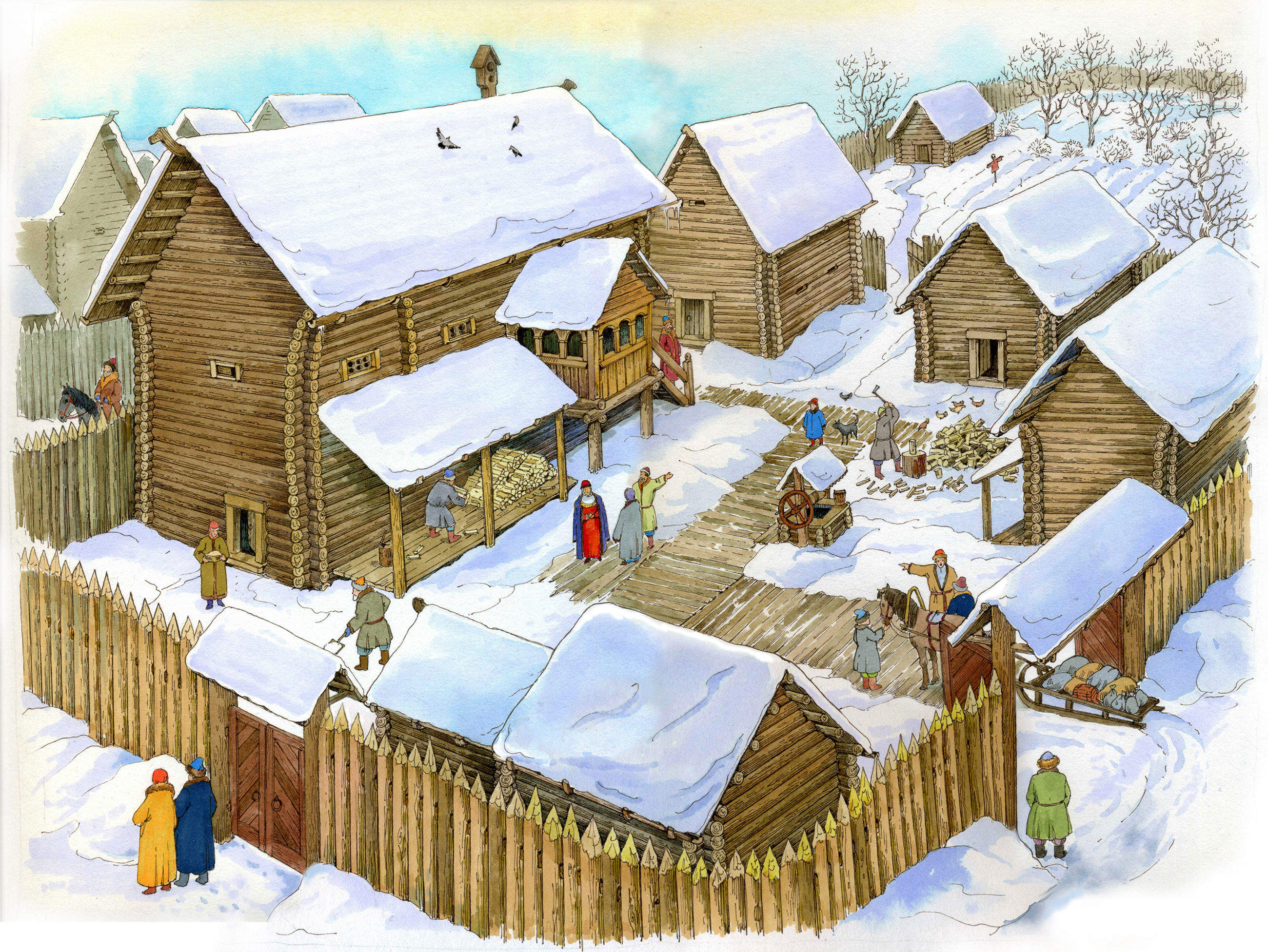
Novgorod 13th century. Reconstruction of housing.
I want to show you a couple of his drawings, all of a sudden it will come in handy for you in your work.
Novgorod manor 13th century.
Novgorod 13th century. Reconstruction of housing.
NPC99 said:BIGGER Kentucky James XXL said:The problem with the textures is that they don't have good normalmaps, since they are essentially photographs. They were included into the game around 10 years ago using graphical techniques that are incompatible with the system they say they're using in bannerlord (PBR). You could get away with not having good normalmaps in 2008, but not in 2018. Even pixel indie platformers are using PBR now. The very presense of this texture is a really bad sign.
A possible explanation somebody pointed out to me is that they're not using PBR for the environments, which would explain why the engine trailer from 3+ years ago looked so much better than this, and why the foliage and landscape in the recent gamescom videos look more or less like warband.
I’m unfamiliar with physical based rendering (PBR), but the old engine power blog showed that tessellation only added enhanced surface geometry at close range for performance optimisation. Most of the screen shots under discussion are long range. Much as I like scenery, I prefer to retain sufficient processing power for larger battles, which during sieges will take place in towns with the same buildings we’re looking at.
https://www.taleworlds.com/en/Games/Bannerlord/Blog/9
Tesselation doesn't affect lighting and predates PBR by some time. It doesn't actually make scenes more optimised because tesselation can only add geometry, not remove it. As a result it can only be used on a few surfaces where it's really needed, usually oceans and sometimes dirt and rocks. But since the engine trailer I've seen no evidence of tesselation at all. They've probably ditched it. It has limited uses anyway.
PBR is a rendering technique which makes lighting more consistent. It makes outdoor scenes in particular look a lot more realistic and allows for various lighting conditions in the same instance. There's no real reason not to use it in this day and age and ironically it makes the 3d artist's job a lot easier. If they're not using PBR for environments I can't imagine why, so it might just be bad lighting.
BIGGER Kentucky James XXL said:NPC99 said:BIGGER Kentucky James XXL said:The problem with the textures is that they don't have good normalmaps, since they are essentially photographs. They were included into the game around 10 years ago using graphical techniques that are incompatible with the system they say they're using in bannerlord (PBR). You could get away with not having good normalmaps in 2008, but not in 2018. Even pixel indie platformers are using PBR now. The very presense of this texture is a really bad sign.
A possible explanation somebody pointed out to me is that they're not using PBR for the environments, which would explain why the engine trailer from 3+ years ago looked so much better than this, and why the foliage and landscape in the recent gamescom videos look more or less like warband.
I’m unfamiliar with physical based rendering (PBR), but the old engine power blog showed that tessellation only added enhanced surface geometry at close range for performance optimisation. Most of the screen shots under discussion are long range. Much as I like scenery, I prefer to retain sufficient processing power for larger battles, which during sieges will take place in towns with the same buildings we’re looking at.
https://www.taleworlds.com/en/Games/Bannerlord/Blog/9
Tesselation doesn't affect lighting and predates PBR by some time. It doesn't actually make scenes more optimised because tesselation can only add geometry, not remove it. As a result it can only be used on a few surfaces where it's really needed, usually oceans and sometimes dirt and rocks. But since the engine trailer I've seen no evidence of tesselation at all. They've probably ditched it. It has limited uses anyway.
PBR is a rendering technique which makes lighting more consistent. It makes outdoor scenes in particular look a lot more realistic and allows for various lighting conditions in the same instance. There's no real reason not to use it in this day and age and ironically it makes the 3d artist's job a lot easier. If they're not using PBR for environments I can't imagine why, so it might just be bad lighting.
Thanks for the clarification. Would PBR still be apparant if TW hadn’t taken the time to bake global illumination into a work in progress scene?
Castles absolutely were dwellings, just well fortified ones. I don't know where they're getting the idea that they weren't.
I'm willing to overlook models and textures that are not cutting edge if it's a trade-off for performance. Also, keep in mind we're seeing screenshots of a handful of towns in a game that will undoubtedly have dozens of them, along with villages and castles spanning eight vastly different factions which will require diverse meshes and textures. It's a monumental undertaking for a small studio like Taleworlds. This is an incredibly ambitious game combining fluid, intricate combat, optimization for large battles, detailed strategy elements, and balancing between what I'm sure are dozens of troop trees.
If you want ultra realistic there are plenty of other AAA titles that master one or two aspects Taleworlds is attempting to tackle in this juggernaut. As for me, I'm more interested in the variety and replay value that has kept me playing Warband and the awesome mods produced by the community than the polished 30 hour experience I get from most $60 AAA titles today.

BIGGER Kentucky James XXL said:I had a closer look at the screenshots (with another 3d modeller friend) and there are some very bad signs.
Look at the closest building. It's flat, essentially a fake building. Warband had these, but they were confined to the very edges of scenes. Unless this is just a mocked up scene for the blog only, it means this image is just window dressing and doesn't represent what the towns are going to be like up close.
What's more, there isn't enough space between buildings to fit a proper street system (with the exception of a very narrow street leading from the right side of the image to the castle, and they seem placed so that we see the front of them rather than to face the streets they're supposedly on. The trees are floating throughout the scene, and clipping with the building under the conveniently placed bannerlord logo.
This is a little hard to spot if you're not a 3d modeller, but the "normals" on the towers are messed up, meaning the lighting is broken. They're messed up in a specific way which can only be present if they've chosen to model the tree trunks at the corner of the tower. Why they decided to do this is beyond me. It adds nothing to the icon since it's not even a pixel wide, but makes it far higher poly than it needs to be. What's frustrating is that this would be a 2-3 minute fix, and is something 3d artists are trained to spot from day one.
Is this a warband texture? Where's the normalmap, seeing as the warband version didn't have one (or didn't have a good one, iirc?)? Is that warband ivy, too? Why reuse these textures which clearly aren't designed for PBR?
I love you guys and sorry for the hakarets and başarılar to you all but please guys i mean come on. Kemal would be spinning in his grave (he's a 3d modeller now, i hear)
----
The problem with the textures is that they don't have good normalmaps, since they are essentially photographs. They were included into the game around 10 years ago using graphical techniques that are incompatible with the system they say they're using in bannerlord (PBR). You could get away with not having good normalmaps in 2008, but not in 2018. Even pixel indie platformers are using PBR now. The very presense of this texture is a really bad sign.
A possible explanation somebody pointed out to me is that they're not using PBR for the environments, which would explain why the engine trailer from 3+ years ago looked so much better than this, and why the foliage and landscape in the recent gamescom videos look more or less like warband.
I'd much rather the entire game look outdated than only portions of it. Nothing is worse than artistic inconsistency. Some of those scenes are outright ugly while others are fairly decent. This seems to be an issue with character design too: the artist we heard from last week said she just used random ideas from games and films rather than from actual concept art. If they have an art director he or she is not doing their job. And if they don't have an art director, especially for a game of this scope, well...GG
----
Tesselation doesn't affect lighting and predates PBR by some time. It doesn't actually make scenes more optimised because tesselation can only add geometry, not remove it. As a result it can only be used on a few surfaces where it's really needed, usually oceans and sometimes dirt and rocks. But since the engine trailer I've seen no evidence of tesselation at all. They've probably ditched it. It has limited uses anyway.
PBR is a rendering technique which makes lighting more consistent. It makes outdoor scenes in particular look a lot more realistic and allows for various lighting conditions in the same instance. There's no real reason not to use it in this day and age and ironically it makes the 3d artist's job a lot easier. If they're not using PBR for environments I can't imagine why, so it might just be bad lighting.
Excellent explanation and exposition. Agree with you 100%.
A general texture enhancement is needed in all aspects, because gentlemen... something strange happens with textures. It is clear that the graphics are not the important thing in this game, but please that we are in 2018-19...
https://giant.gfycat.com/HandySentimentalBighornsheep.mp4
https://giant.gfycat.com/PoorMinorJanenschia.mp4
https://giant.gfycat.com/PoorMinorJanenschia.mp4

-------------
And another thing, for the size of the city there is very little influx of people. The streets should be full of urban life (Moving).
Constructive Criticism
NPC99 said:Thanks for the clarification. Would PBR still be apparant if TW hadn’t taken the time to bake global illumination into a work in progress scene?
Global illumination is mostly separate from PBR and has existed in some form since the half life 1 era.
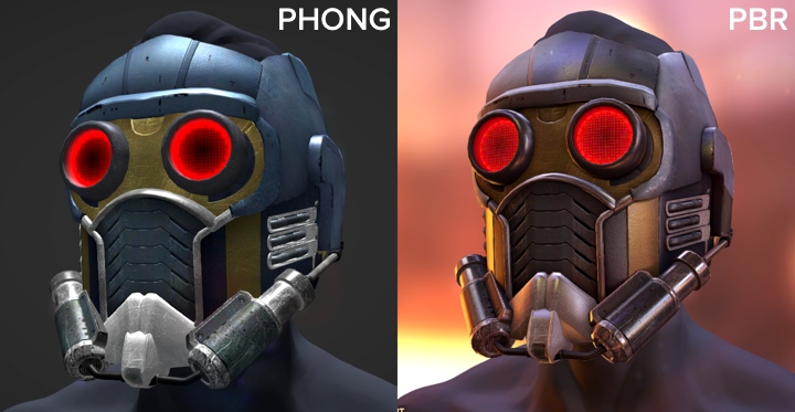
These two images show the difference between PBR and the "phong" shader model which has been around since the 1970s. What PBR does is simulates the mathematics inherent to an interaction between a surface and a photon, and allows models to be lit by an approximation of their surroundings. A person in a red room is going to be in completely different lighting conditions to someone in a yellow room because light bounces off everything. For years this has been a problem which got worse over time as developers strove for more realism. The human eye is extremely good at detecting lighting inconsistecy (which is the main reason photoshop jobs aren't hard to spot).
Warband tries to solve this with an extremely ugly green light from below which is supposed to represent the reflective grass. Other pre-pbr games would tweak their lighting in different scenes so that these inconsistencies wouldn't occur so often. The problem came to a head in the early 2010s where models would have 7+ separate textures to simulate different elements of light, and still look awful in certain scenes. PBR on the other hand can work in any lighting condition and almost any material type with 3-4, max. It's physically based, i.e. it uses the equations of photon physics to generate lighting and shading.
Global illumination is just a technique for simulating bounced lighting in a scene. Bounced lighting is the reason you can see things which aren't lit directly by a light source, like the unlit side of a building or an indoor room during the daytime. Some really old games have early versions of this. When dynamic lighting was invented it was essential for indoor scenes because otherwise the lighting would be flat and unrealistic, or just plain black. Here's what I mean:
This is generally too taxing to be calculated at runtime so it has to be precalculated or "baked" first. This prevents things like a day/night cycle however.
Kentai said:I'm willing to overlook models and textures that are not cutting edge if it's a trade-off for performance.
It's not. What I've listed are amateur mistakes which would actually have a positive impact on performance if they were implemented. Generally it's actually the highest quality assets which are the lightest on performance compared to less professional attempts. Ever wondered why crappy steam games run so poorly?

BNS Marko said:Great analysis, BIGGER Kentucky James XXL. Hopefully some of this catches the eye of the development team.
And as development time continues to increase, release date is continuously pushed back. Lol JK or am I?
BIGGER Kentucky James XXL, I am very interested in what you would propose then, what would be your vision of approach to solve this problem? How long would it take to improve the textures by giving it a realistic hd feel?
Thank you in advance
Thank you in advance
Similar threads
- Sticky
- Article
- Replies
- 37
- Views
- 7K