


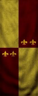
VN you are a dedicated fan but you must work on those flags so that they look more convincing. Take a look at Hot Cobblers work. Your flags look like surfaces of sport cars. But practice makes perfect!
You are using an out of date browser. It may not display this or other websites correctly.
You should upgrade or use an alternative browser.
You should upgrade or use an alternative browser.
Your Banners
- Thread starter Vaelius Noctu
- Start date
Users who are viewing this thread
Total: 2 (members: 0, guests: 2)
Vaelius Noctu
Veteran

Thanks,
I know, But I dont know how to make this Spezial Design. But you or hotcobbler can made me some blank and colored Banners. I can use them as Model for Banners.
I need the colores I used on the Banners in the Forum here. Very thanks for our help.
Vaelius Noctu
I know, But I dont know how to make this Spezial Design. But you or hotcobbler can made me some blank and colored Banners. I can use them as Model for Banners.
I need the colores I used on the Banners in the Forum here. Very thanks for our help.
Vaelius Noctu
hotcobbler
Regular

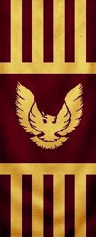
The first eagle looks perfect. It looks weathered and realistic. Try to copy that style throughout your work and you'll do well.
Vaelius Noctu
Veteran
Thanks
I have worked on a black blank Banner and have make some changes about them. Make them darker. The brighter Version looks at the Sourcout Bad.
(Pics moved --> by myself^^)
p.s.: I open banners with GIMP and remove the Objects on it. It works not really good for me I am a Perfectionist. Everything have a better way tell me please.
Nice VC! Your banner are finnaly reaching quality. I might just use some. 

I guess I did. But I gave credits to banner thread where I picked it up. Nice flags btw.
hotcobbler
Regular
Ok, so here is my finished product for now. I know I'll eventually add more, and maybe refine some of them, but for now I'm pretty happy. Let me know what you think.


I redid the first 2 default banners too, I think they look great in game.
I redid the first 2 default banners too, I think they look great in game.
Vaelius Noctu
Veteran
@hotcobbler
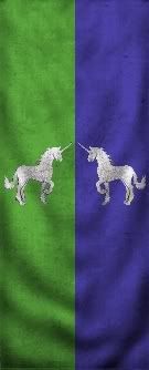
my Favorite was 9,1 the twohead Eagle.^^
my Favorite was 9,1 the twohead Eagle.^^
hotcobbler
Regular
Yeah, that one was a quick fix for me. I was just trying to distinguish it from the flag of Scotland. I guess I can work on that one today though. It does look a little funny now that I'm seeing again.
hotcobbler
Regular
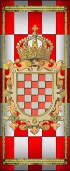
Putting a whole crest on a banner doesn't make much sense, since the banner would only include the actual shield design. The crest is more of a formal artistic representation of the arms.
Vaelius Noctu
Veteran
Sorry my English is not so good. I dont know what do you want to say with:
Since the banner would only include the actual shield design. The crest is more of a formal artistic representation of the arms.
Das Symbol muss ganz auf das Schild Passen? Ok, wenn ich es richtig Verstanden habe. Die Krone ist nur eine formelle, künstlerische Darstellung der Soldaten/Waffen? Ich bin verwirrt.
hotcobbler
Regular
I haven't had time to upload my changes, but here's a link for it now. Feel free to use it however you'd like, just mention my name. I'm still making changes, and I swear I'll put one of those eagle banners in there vaelius.
L&R Banner Pack 1.0
L&R Banner Pack 1.0

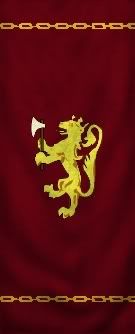
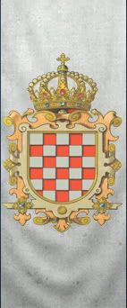
Trampo said:These are mine:
Its an old emblem of my country; Croatia .
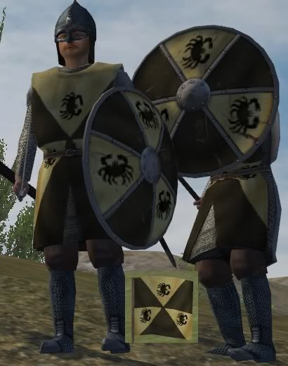
I have also modified some armors with my emblem
Hope you like it
Aj napravi verziju da nije ustaški grb pa ću ga ubacit u iduću verziju Lordsa.

Are these banners looks normaly on chest of heraldic surcoat and shield or the part of it is lower belt?
Similar threads
- Replies
- 0
- Views
- 221
- Replies
- 0
- Views
- 129