SP - UI World map left panel reworking suggestion

Users who are viewing this thread

Terco_Viejo

Spanish Gifquisition
Grandmaster Knight
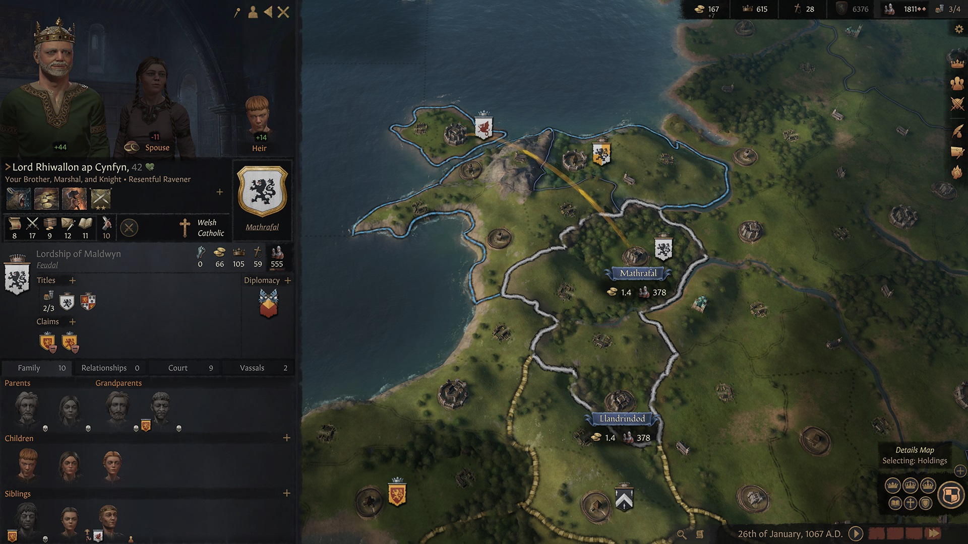
Bannerlord is a complex game and complex is the arrangement of the information elements of its UI. An informative element which personally burdens my eyes is the left panel; in my opinion it is too intrusive. I propose as a graphic suggestion a significant reduction of it size and a guideline of how to show it.

In the game this panel is displayed from left to right. I suggest that both the settlement or event panel be displayed by sliding from top to bottom. For settlement panels, icons would be displayed as direct shortcuts at the top of the header and the drop-down (multi-option) icons inside the information panel with a scroll bar. For events, the information inside the panel.

The user could make the tooltip for each icon appear by means of a mouse action hover. With this slight retouching the ui map will breathe imo, making the map even more main character.

Current layoutSuggested layout
Rarmp.jpg
XBgiV.jpg
JPr6i.jpg
RXUse.jpg
RC_38.jpg
_79XK.jpg

 
Last edited by a moderator:
Terco, my good friend, you have your toll of great ideas and contributions and you are certainly in TaleWorlds' hall of fame.

That being said, I didn't like your suggestion this time around, I very much prefer the UI as it is.
 
Terco, my good friend, you have your toll of great ideas and contributions and you are certainly in TaleWorlds' hall of fame.

That being said, I didn't like your suggestion this time around, I very much prefer the UI as it is.

And so valid is your opinion mate; I even thank you for coming by to comment. :wink:

To a certain extent, I think Taleworlds must be fed up with having every aspect of their game questioned; however, that should be a reason for internal self-reflection. It'S EaRlY aCcEsS! :iamamoron:

If we look at the UI (as in other aspects of the game); we see that the map UI has nothing to do with the barter UI, the encyclopedia UI has nothing to do with the perks UI... and again...etc. By this I mean that you can see that each of the artists who have developed their part of UI have gone their own way. Visually there are significant differences between the event panel and the settlement panel; and it shouldn't be like that, but everything should have an artistic line alike..

At this point in the development I doubt very much that they will start to change this kind of things. I find that kind of panel works wonderfully in games like CK because they are well loaded with information. In Bannerlord, that square interferes with the campaign map too big for the little information they contain, which (even more so after its wonderful revamp) should be the protagonist.

Personally I would move away from "CK styles" and approach "Anno styles" where the information would be displayed if the user clicks on a certain icon. The world map would be much more eye-catching without so many disproportionate elements.

UI style NOT suitable for BannerlordUI style suitable for Bannerlord
a503f3937ca5244aa48541e32fc6c40fbdd78675.jpg
DThnsp7.jpg

(*suitable) in my opinion
 
Visually there are significant differences between the event panel and the settlement panel; and it shouldn't be like that, but everything should have an artistic line alike..
Yes in this matter I totally agree.

It looks like every piece of UI was made by a different team.
The trade, smithy and barter screens are so different from each other in art style and functionality that they seem to belong to different games.

While I'm okay with the trade screen, the smithy and barter screens need a rework to be streamlined with the rest of the game.
 
Back
Top Bottom