SP - UI Use fade-in text to let it appear and make the size of UI adjustable

Users who are viewing this thread

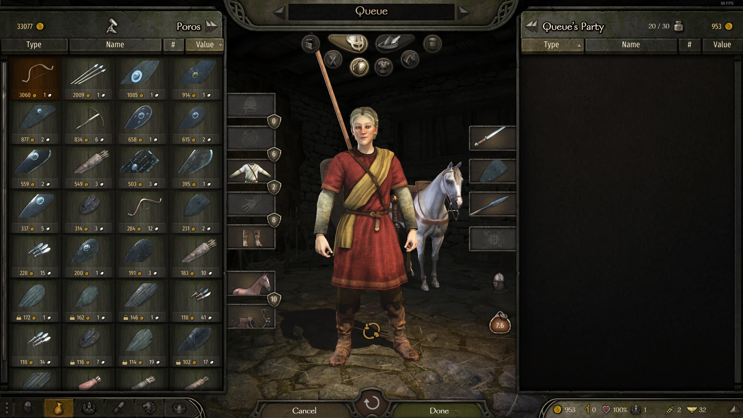
Those words on UI are not so noticeable and always to miss reading what it has written,because they just pop up on the corner of screen directly and still too tiny for recognizing easily.Also,the icons inside inventory are so small.If not by description of text it's really hard to find what's really on that interface,and looks not so lively as warband did.
I hope the size of UI can be adjustable by settings or simply make it more convenient to use.Some buttons on UI are too narrow,and still need hover borders or kind of things to indicate where are effective range and avoid misclick.
 
Last edited:
Making the current UI bigger(instead of smaller) almost requires designing the whole UI from scratch. If you can list the specific screens and panels that you find hard to read, I can take a look individually and see what we can do. So far you listed: inventory and the bottom left log. Anything else?
 
Making the current UI bigger(instead of smaller) almost requires designing the whole UI from scratch. If you can list the specific screens and panels that you find hard to read, I can take a look individually and see what we can do. So far you listed: inventory and the bottom left log. Anything else?
Yes,these texts of morale,move speed,and income kind of things on the right bottom are also too tiny to read.I mean the whole of UI don't have to be bigger or remake.
The icons of goods are shown to be tiny on inventory bars.A Classic type of warband UI based on the current screen is ok,or it may capable of being switched to new style of bannerlord in settings.It just looks like what this mod 'inventoryUI overhaul' show up.
2679-1612109681-778813463.png

2679-1612109766-373729142.png
 
Last edited:
Back
Top Bottom