The troops icons are so ugly now in captain mode

Users who are viewing this thread

cheeaboo

Recruit
^^

I haven't play other MP game modes other than captain so I don't know if this is just a captain mode thing or for all MP game modes.

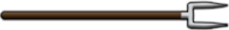
I don't know why TW decided to change it but the troops icons are so ugly now, especially during troop selection phrase. It now covers almost half of player's avatar, and the solution of the icon is clearly too low for that. Also, the icon for archers are noticeably squashed. Please improve this or revert it back to before the update, it hurts my eyes! Thank you.
 
Role/class icons on top of the screen which you can see overlayed on peoples steam icons. They were half the size before. Now are pixelated and stretched. Sorry for no screenshot.
 
+1 I wouldn't mind it if the images were still sharp/focused but it looks fuzzy. The symbols also look stretched after leaving the class selection screen once the game starts.
 
Ok it seems old style size icons still load for few seconds when you join. Here is comparision
Old(top) vs new(bottom):
uTa3aK1.png
 
Thanks for clarifying the image! Honestly, I did not notice the change. They are a bit cloudy at the moment. However, I would like them to put there energy into cranking out more TDM battlefields.
 
So I looked closely and want to clarify. You can see those big icons only when you are selecting your role. Smaller ones are displayed after you spawn.
 
The icons were very small making it hard to notice the difference between light archer or heavy archer, etc. Blowing up the size of the icons and stretching its dimensions was not the most visually appealing fix but we can see what classes are being picked now at least.
 
Ok it seems old style size icons still load for few seconds when you join. Here is comparision
Old(top) vs new(bottom):
uTa3aK1.png
Still you can see that the icons for cavalry and archers seems squished after the troops selection screen. I would be so much happier if TW could make these icons less distorted.
 
+1 I wouldn't mind it if the images were still sharp/focused but it looks fuzzy. The symbols also look stretched after leaving the class selection screen once the game starts.
Exactly! It would be great if they could give some higher solution version of the current icons, or maybe just removing the circle icon and only have the troop icons instead? By that I mean now an icon contains a circular icon of some animals and at the left of it is the troop symbol, and maybe it would be better if TW could just remove the circular icon of animals and only have this troop symbol instead? This way they can make the icon larger without covering up almost half of the player's avatar, so that would look better?
 
Back
Top Bottom