


Simple banners work the best...
- Home
- Forums
- Mount & Blade: Warband
- The Forge - Mod Development
- The Caravanserai - Released Mods
- Warband
- Vikingr [M]
- Vikingr: Clans
You are using an out of date browser. It may not display this or other websites correctly.
You should upgrade or use an alternative browser.
You should upgrade or use an alternative browser.
The Sons of Ragnarr (VÍKINGAR/NA) "A Casual Clan for Casual Players"
- Thread starter kpetschulat
- Start date
Users who are viewing this thread
Total: 2 (members: 0, guests: 2)
- Status
- Not open for further replies.
kpetschulat
 Banned
Leifr Eiríksson said:Simple banners work the best...
I agree. It looks perfect. It's a painted banner. Quite common back then for banners to have their symbols/insignias painted on.


kpetschulat
Banned
Maybe, a light blue, to give the effect it was painted on with woad... ?

Color was just paintbucketed over... done quickly.
Color was just paintbucketed over... done quickly.
nurgle01099
Sergeant

sooo, should I throw out the shield, banner, and flag images I made?
Once you've finalised a design, send it (in .psd I suppose, if possible) to Moeckerkalfie. You might be a tad late at this point to fit it into the next patch.
HannesFury
Sergeant Knight

Maroonish seemed to have done it. Red often does. Quite nice design overall! Don't forget to ponder on adding the normative shields. Outline their shape, and make 'em transparent in some way on parts covering the hull. Heck, even try it in the style of rock carvings! The red would fit in very well in that case.
kpetschulat
Banned
nurgle01099 said:sooo, should I throw out the shield, banner, and flag images I made?
Nooo, don't throw them out. Send them to Moeckerkalfie. Even if we don't end up using them, they are still great additions to the mod, and can be added as a donation from you. Jut be sure to tell him what they're for, rather than just shooting him over random banners.

HannesFury said:Maroonish seemed to have done it.
Lol, yup. It is the best color. Looks like it's painted with blood.
By the way, do you guys want to have a clan night again? Like last night. That was fun!
Hospes fori
Count

What happened to Canada and Mexico?kpetschulat said:

A rare but all the more wise opinion. Ever so often, less is more.Leifr Eiríksson said:Simple banners work the best...
I have to disagree. Charges were sewn on banners. Of course, fabrics were died but I am not even sure if there was a proper way known of how to paint fabric anyway.kpetschulat said:Quite common back then for banners to have their symbols/insignias painted on.

I'd say Nurgle's banner is more finished than the other at this point. I also like it
like I said i'm no good with photoshop, the design of the ship banner was does in 10 minutes thats why it looks so low res and a little unfinished if someone could make it look sharper i'd much appreciate it as it would be the quality needed for this mod. It also doesn't help that the drawing was taken from an image of the coin and then filled in with red.Aklis said:I like the banner, but it could be sharper. Right now it looks very low-res to me.
I thought the exact same thing when making it but i liked the red ship, maybe a different background instead?hrotha said:I wouldn't add more colours but I would consider using different colours, to make it more unique compared to the Erlingr banner.
I liked your banner finner I just thought it seemed more like a Goidil banner rather than a Nordmenn one.nurgle01099 said:sooo, should I throw out the shield, banner, and flag images I made?
Sorry i wish I could have been here but i was out maybe tomorrow?kpetschulat said:By the way, do you guys want to have a clan night again? Like last night. That was fun!
nurgle01099
Sergeant
Well since ships seem to be the new thing, I took the liberty of Sharpening up Lokoout's ship banner. I retraced the outline and made it more symmetrical, and more straight where it needed to be. I made it look quite nice...
And then I put it on my banner muhahah!


Look at the difference!
But really, the ship should look better now. The Runes say "Ragnarr" according to a funky website I found, so it is most likely incorrect, I was just having some fun.
And then I put it on my banner muhahah!
Look at the difference!
But really, the ship should look better now. The Runes say "Ragnarr" according to a funky website I found, so it is most likely incorrect, I was just having some fun.
I love it finnr, thanks for doing that i suck at anything graphical. the runes according to a book I have should like something like this going based off the futhark :
 the second and fith are the same just to let you know. the name of the runes are Reid, As,Kaun, Naud,As,Reid,Reid the book also shows a rune Hagal:
![wHKe035.png]](http://i.imgur.com/wHKe035.png]) as a possible replacement for G. again this is all going based off a book and i am not saying it is correct. the kallby runestones have the name ragnarr but i can't find anything that shows the runes very clear
as a possible replacement for G. again this is all going based off a book and i am not saying it is correct. the kallby runestones have the name ragnarr but i can't find anything that shows the runes very clear
kpetschulat
Banned
nurgle01099 said:
Look at the difference!
Yeah, no kidding! That looks so much better. As I said before, message Moeckerkalfie with the banner update.
I'd definately recommend using the Younger Futhark ~ 8th to 12th century:
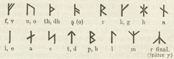
or the Medieval Futhark ~ 12th century onwards:

Normally what is written on runestones is: "Raknar" (with the Younger Futhark)
or the Medieval Futhark ~ 12th century onwards:
Normally what is written on runestones is: "Raknar" (with the Younger Futhark)
I like the red ship on the blue-green background though.
A small note: You should place the symbol slightly higher for it to show properly on the in game banners... Maybe even scale it down a little.
A small note: You should place the symbol slightly higher for it to show properly on the in game banners... Maybe even scale it down a little.
Scrap the green strips and lighten the blue a little (but not sky/baby blue!).
nurgle01099
Sergeant
Alright, I'm on a roll pumping out banners, check these out


Tell me which is better, I'll probally add even more banners as the day goes on.
Edit: Three banners in an hour? what am I doing with my life
Tell me which is better, I'll probally add even more banners as the day goes on.
Edit: Three banners in an hour? what am I doing with my life
- Status
- Not open for further replies.
Similar threads
- Replies
- 21
- Views
- 786