


This is a "suggestion" that the devs could probably implement in... like half-hour if they wanted to.
The UI visibility is low in the game, due to the colors -- please change it to brighter, easily-seen colors.
What I mean by this, is that some of the UI in the game -- particularly the troop movement position/formation indicators -- are darker shade of green, with the position indicator being a dark shade of blue in a shape of a banner.
Now, UI, is simply "unrealistic." A UI is there for player convenience.
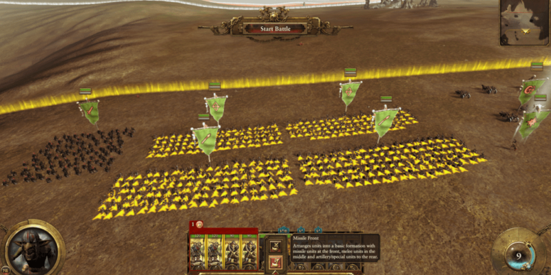
Look at the interface above, in Total War: Warhammer. The position indicators are bright yellow. The lines indicating deployment boundaries are also bright yellow. Bright and visible. In the current game, the troop formation/position indicators are not-so-bright green, on top of.... grass. The deployment line indicator, is pale and washed-out white, which becomes hard to see even on grass, and basically becomes invisible on a snow.
Please makes those UI interfaces that super-impose icons/positions on the terrain, into a brighter, vibrant color to make it easier to see.
The UI visibility is low in the game, due to the colors -- please change it to brighter, easily-seen colors.
What I mean by this, is that some of the UI in the game -- particularly the troop movement position/formation indicators -- are darker shade of green, with the position indicator being a dark shade of blue in a shape of a banner.
Now, UI, is simply "unrealistic." A UI is there for player convenience.
Look at the interface above, in Total War: Warhammer. The position indicators are bright yellow. The lines indicating deployment boundaries are also bright yellow. Bright and visible. In the current game, the troop formation/position indicators are not-so-bright green, on top of.... grass. The deployment line indicator, is pale and washed-out white, which becomes hard to see even on grass, and basically becomes invisible on a snow.
Please makes those UI interfaces that super-impose icons/positions on the terrain, into a brighter, vibrant color to make it easier to see.
