New rank images!

Users who are viewing this thread

Dejan

Community Manager
Greetings community!

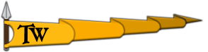
We've updated and refreshed our existing rank images that have brilliantly served our community over the past years. I would like to once again extend our gratitude to the original creator, our Weaponsmith @Eogan and everyone else that contributed to the creation process.

The rank images were updated by one of our community members who wishes to remain anonymous. You can check them out here. Thank you very much!

Have a nice weekend everyone!
 
Last edited:
Likewise, have a great weekend!

These polished rank images really look well, as they seem to have been redrawn and readjusted to fit well in the forum's visual style. It is great that author of new rank pictures chose to retain previous images' appearance for user convenience's sake. They are consistent with TaleWorlds' forum prevalent aesthetics after XenForo migration and, moreover, they are much smoother, "mellow" and less conspicuous (in terms of their resolution). With anti-aliasing, to which they all have been subjected, they look much more fresh.

On the other hand, another old forum artifact is now gone.
 
I'm not saying these new ones look bad or anything, old design was just more appealing to me.
Am i the only one who liked the old version?

The old designs' resolutions were too small, which worked fine for SMF, but for zenforo, they'd need to be larger, not only that, the old designs were built with the old beige colour scheme in mind, meaning they looked rather jagged on the current blue xenforo scheme. Instead of upscaling the (now old) ranks, it's best to design something which is modern but still keeps the novelty of the older designs; there's also very little difference between the actual designs, maybe a few less ripples in the flag, but that's really about it, the rest are scaled up almost one to one...

I agree the older designs may have had more 'character' and were really cool, but there comes a time to modernise :razz:
 
The old designs' resolutions were too small, which worked fine for SMF, but for zenforo, they'd need to be larger, not only that, the old designs were built with the old beige colour scheme in mind, meaning they looked rather jagged on the current blue xenforo scheme. Instead of upscaling the (now old) ranks, it's best to design something which is modern but still keeps the novelty of the older designs; there's also very little difference between the actual designs, maybe a few less ripples in the flag, but that's really about it, the rest are scaled up almost one to one...
speaking of resolutions emojis need a rework too :wink:
 
On probation rank looks dope
Here's hoping you never have it.


xxl5IhQ.gif
 
Back
Top Bottom