


<p>To all interested and uninterested parties, let it be known that we at TaleWorlds are making a new game, by the name of Mount&Blade II: Bannerlord. It is the next in the Mount&Blade series and a prequel to Mount&Blade Warband. This is the third entry in our Developer Blog, talking about making the game to whoever wants to listen. Thisweek we're talking about the campaign team, developers of the game's single player mechanics and gameplay. The team formerly known as “Team 3”...</p></br> Read more at: http://www.taleworlds.com/en/Games/Bannerlord/Blog/4
You are using an out of date browser. It may not display this or other websites correctly.
You should upgrade or use an alternative browser.
You should upgrade or use an alternative browser.
Mount&Blade II: Bannerlord Developer Blog 3 - Unexpected Parties
- Thread starter captain lust
- Start date
Users who are viewing this thread
Total: 2 (members: 0, guests: 2)
TheGME
Veteran

Captain Lust said:next in the Mount&Blade series and a prequel to Mount&Blade Warband
So does this mean the calrad empire will have just collapsed at the time of the game?

So obviously I'm a bit late to the party, but as a long time fan who does user experience assessment as part of my job, I saw this and just had to comment. First and foremost, it's great to see that the team has clearly identified user interface as an area where the previous games fell short. I always felt that UI was the single biggest failing of the series, and was one of the biggest barriers I noticed that prevented people I introduced to the series from getting into it.
Shopping is a mechanic!
It's often said that the gameplay mechanics of most RPGs basically come down to fighting and shopping, so the usability of this particular interface is likely to critical to the game's success. Therefore, it's encouraging that this was the interface example featured in the post, as it suggests Taleworlds is looking hard at the interface elements that support this core mechanic.
Left-right congruency and parallelism
Design-wise, it looks like the team is going for a "one-stop-shop" approach to the purchasing menu, with buying, selling, and equipping functions all available simultaneously (I assume there's also a separate equip interface that's available when not buying or selling at a vendor). This is a good idea in a lot of ways, because it reduces the probability of users making mode errors (mistakes where they sell a bunch of items they meant to buy, or visa versa because they were confused about which mode the interface was in). This kind of left-right congruent interface is a good way to do buying and selling. As an example, Skyrim doesn't use this kind of interface, and as a result you often aren't sure whether you're selling your items or buying the merchant's items.
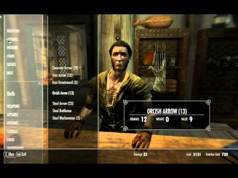
Example: skyrim default merchant interface. Are we buying or selling? If we hit "E," will that buy the item selected, switch us to buy mode, or change from buy to sell mode?
The one stop shop approach does a lot to resolve this, as long as it's clear (and consistent across menus) which inventory panel belongs to whom. Color coding could be used to help emphasize this too, but a lot of times art teams don't like that because it messes with their color palette.
Display the most user-relevant information
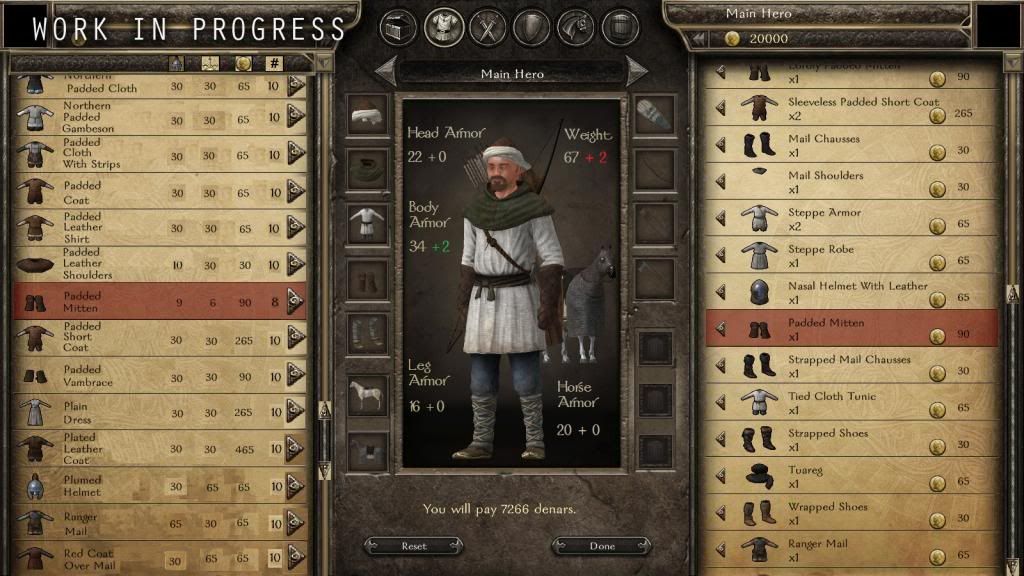
While the basic composition of the interface makes a lot of sense, there are some other things that are likely to promote confusion or mistakes by users. First and foremost, the interface shows three properties for each item - a rough icon of its appearance, its name, and its cost. While these are important, the most critical aspect of each item is not shown - its actual effect on gameplay! How much does the northern padded gambeson add to my armor and weight? Right now it appears that the only way to tell is to equip it on my character and then subtract the previous values for armor and weight to see the difference (if I can remember them). This will be made more complicated if (as in previous games) some items affect, say, both body and leg armor, or have other values (like health and resistance for shields, or damage type for weapons with more than one attack mode).

The original WIP interface posted to the blog. Note that only price, name, and appearance are shown.
The interface for Warbands handled all of this with tooltips (i.e. there was even less info displayed on items), which wasn't much better, as you had to look at each item individually, although it did support the fantasy experience of the user (Malone, 1980 - http://cci.mit.edu/malone/tm%20study%20144.html) to some degree by making the user inspect each item like they were browsing in a shop. Still, this is quite inefficient, especially for new users who haven't learned to identify the icons for the nine or ten items that experienced users know are the only weapons and armor that are worth using.
Item effect comparisons
Another way to help users make good decisions quickly would be to show the impact of equipping the selected item on the paper doll. This would be most important with the effect on armor, weapon, or other item stats (see the mockup down at the bottom of the post), but it might also be neat to show the visual impact of the item switch on the avatar "paper doll."
Sortability
Ultimately, however, the primary result is likely to be lots and lots of lost time as users try on one item after another. Worse, they're likely to miss out on the best items in the mess and buy inferior or less appropriate items. This could be easily resolved by making the items sortable by each relevant property (primary statistic, weight, cost, and other things like damage type or required weapon skill for other types of items). This would allow the user to find, say, the lightest, or the cheapest, or the most protective armor type available, depending on their needs.
Fonts
There are other general issues. The signature "Mordred" font is a good choice, being both readable and appropriate for the setting (although it looks like it isn't quite Mordred anymore - some sort of variant?). However, in this interface the fonts are sometimes too small, leaving lots of dead space that isn't serving any function while also decreasing readability. An example of this is the armor value indicators and the numbers indicating prices, which are both unnecessarily small and oddly placed in the cell.
Arrow Indicators
It's impossible to tell from the screenshot (mockup?) whether the arrows are buttons, or just indicators. The highlighted row seems to suggest the latter. If so, then the arrows should be made to look less like buttons so people don't click uselessly on them. If they are buttons, then they ought to be made larger so people can click on them more easily (See Fitts's law at http://en.wikipedia.org/wiki/Fitts%27s_law to see just how much target size effects efficiency).
Scroll Bars
So the scroll bars have a cool-looking ambiance, but unfortunately some users might confuse the slider for the bar, especially since they appear to be dynamically-sized by list length, and so users won't necessarily be able to use this as a cue. This one should be an easier fix - consider putting a small area of a different pattern or texture at each end of the bar (ideally an arrow or arrow-like pattern of some kind) to help users tell the bar from the slider at a glance.
I did a quick and dirty mockup of some of the issues I pointed out above. I left the right side untouched, partly for comparison, and partly because I'm lazy. Anyway, see below.
Mockup of one possible alternate interface.
Anyway, that's what I spotted in a quick review of the interface screen. Hopefully this doesn't come across as too overbearing. I'm a huge fan of this series, and I'd just love to be able to tell my friends about the game without having to first spend five minutes explaining that they'll get used to the interface eventually, and that there's a great game underneath that. Accordingly, I hope you'll take my feedback in the spirit it's intended. I also hope that you guys are planning to do some direct user testing - you can do both empirical comparisons and think-aloud protocol tests with just the kind of static screenshots you've shown, but you can also get a lot more value out of your usability testing if you get users to play the actual build. Check out Steve Krug's Rocket Surgery Made Easy (http://www.amazon.com/Rocket-Surgery-Made-Easy-Do-It-Yourself/dp/0321657292#) for pointers, or better yet, get in touch with some usability specialists or game user researchers. There are academic programs around the world that also offer free or discounted user experience testing to clients to enhance their students' learning experience, which can be a great deal for a small game studio as well.
Anyway, keep up the great work guys! It looks fantastic so far, and I'm just dying to see what you come up with in the final product!
Shopping is a mechanic!
It's often said that the gameplay mechanics of most RPGs basically come down to fighting and shopping, so the usability of this particular interface is likely to critical to the game's success. Therefore, it's encouraging that this was the interface example featured in the post, as it suggests Taleworlds is looking hard at the interface elements that support this core mechanic.
Left-right congruency and parallelism
Design-wise, it looks like the team is going for a "one-stop-shop" approach to the purchasing menu, with buying, selling, and equipping functions all available simultaneously (I assume there's also a separate equip interface that's available when not buying or selling at a vendor). This is a good idea in a lot of ways, because it reduces the probability of users making mode errors (mistakes where they sell a bunch of items they meant to buy, or visa versa because they were confused about which mode the interface was in). This kind of left-right congruent interface is a good way to do buying and selling. As an example, Skyrim doesn't use this kind of interface, and as a result you often aren't sure whether you're selling your items or buying the merchant's items.
Example: skyrim default merchant interface. Are we buying or selling? If we hit "E," will that buy the item selected, switch us to buy mode, or change from buy to sell mode?
The one stop shop approach does a lot to resolve this, as long as it's clear (and consistent across menus) which inventory panel belongs to whom. Color coding could be used to help emphasize this too, but a lot of times art teams don't like that because it messes with their color palette.
Display the most user-relevant information
While the basic composition of the interface makes a lot of sense, there are some other things that are likely to promote confusion or mistakes by users. First and foremost, the interface shows three properties for each item - a rough icon of its appearance, its name, and its cost. While these are important, the most critical aspect of each item is not shown - its actual effect on gameplay! How much does the northern padded gambeson add to my armor and weight? Right now it appears that the only way to tell is to equip it on my character and then subtract the previous values for armor and weight to see the difference (if I can remember them). This will be made more complicated if (as in previous games) some items affect, say, both body and leg armor, or have other values (like health and resistance for shields, or damage type for weapons with more than one attack mode).
The original WIP interface posted to the blog. Note that only price, name, and appearance are shown.
The interface for Warbands handled all of this with tooltips (i.e. there was even less info displayed on items), which wasn't much better, as you had to look at each item individually, although it did support the fantasy experience of the user (Malone, 1980 - http://cci.mit.edu/malone/tm%20study%20144.html) to some degree by making the user inspect each item like they were browsing in a shop. Still, this is quite inefficient, especially for new users who haven't learned to identify the icons for the nine or ten items that experienced users know are the only weapons and armor that are worth using.
Item effect comparisons
Another way to help users make good decisions quickly would be to show the impact of equipping the selected item on the paper doll. This would be most important with the effect on armor, weapon, or other item stats (see the mockup down at the bottom of the post), but it might also be neat to show the visual impact of the item switch on the avatar "paper doll."
Sortability
Ultimately, however, the primary result is likely to be lots and lots of lost time as users try on one item after another. Worse, they're likely to miss out on the best items in the mess and buy inferior or less appropriate items. This could be easily resolved by making the items sortable by each relevant property (primary statistic, weight, cost, and other things like damage type or required weapon skill for other types of items). This would allow the user to find, say, the lightest, or the cheapest, or the most protective armor type available, depending on their needs.
Fonts
There are other general issues. The signature "Mordred" font is a good choice, being both readable and appropriate for the setting (although it looks like it isn't quite Mordred anymore - some sort of variant?). However, in this interface the fonts are sometimes too small, leaving lots of dead space that isn't serving any function while also decreasing readability. An example of this is the armor value indicators and the numbers indicating prices, which are both unnecessarily small and oddly placed in the cell.
Arrow Indicators
It's impossible to tell from the screenshot (mockup?) whether the arrows are buttons, or just indicators. The highlighted row seems to suggest the latter. If so, then the arrows should be made to look less like buttons so people don't click uselessly on them. If they are buttons, then they ought to be made larger so people can click on them more easily (See Fitts's law at http://en.wikipedia.org/wiki/Fitts%27s_law to see just how much target size effects efficiency).
Scroll Bars
So the scroll bars have a cool-looking ambiance, but unfortunately some users might confuse the slider for the bar, especially since they appear to be dynamically-sized by list length, and so users won't necessarily be able to use this as a cue. This one should be an easier fix - consider putting a small area of a different pattern or texture at each end of the bar (ideally an arrow or arrow-like pattern of some kind) to help users tell the bar from the slider at a glance.
I did a quick and dirty mockup of some of the issues I pointed out above. I left the right side untouched, partly for comparison, and partly because I'm lazy. Anyway, see below.

Mockup of one possible alternate interface.
Anyway, that's what I spotted in a quick review of the interface screen. Hopefully this doesn't come across as too overbearing. I'm a huge fan of this series, and I'd just love to be able to tell my friends about the game without having to first spend five minutes explaining that they'll get used to the interface eventually, and that there's a great game underneath that. Accordingly, I hope you'll take my feedback in the spirit it's intended. I also hope that you guys are planning to do some direct user testing - you can do both empirical comparisons and think-aloud protocol tests with just the kind of static screenshots you've shown, but you can also get a lot more value out of your usability testing if you get users to play the actual build. Check out Steve Krug's Rocket Surgery Made Easy (http://www.amazon.com/Rocket-Surgery-Made-Easy-Do-It-Yourself/dp/0321657292#) for pointers, or better yet, get in touch with some usability specialists or game user researchers. There are academic programs around the world that also offer free or discounted user experience testing to clients to enhance their students' learning experience, which can be a great deal for a small game studio as well.
Anyway, keep up the great work guys! It looks fantastic so far, and I'm just dying to see what you come up with in the final product!


cave sexte said:
Mockup of one possible alternate interface.
Please pay attention to this man's commentary, TW.
Heroes_Witch_King
@cave sexte your comment is excellent! I completely agree with what you said.
I'd just like to point out that for those of you who played Skyrim, if you know the amazing mod SkyUI then how it would be amazing if Bannerlord had a similar User Interface to the one this mod for Skyrim has.
I mean, SkyUI basically made gaming lives for players much easier, it was easy to check out your current stuff, buy new items etc.
Also, I loved the most that it allows you to type the name of the specific item you are searching for. Bannerlord could have a similar UI to this.
It would be much more easier for players and also it's pretty damn cool
cave sexte said:So obviously I'm a bit late to the party, but as a long time fan who does user experience assessment as part of my job, I saw this and just had to comment. First and foremost, it's great to see that the team has clearly identified user interface as an area where the previous games fell short. I always felt that UI was the single biggest failing of the series, and was one of the biggest barriers I noticed that prevented people I introduced to the series from getting into it.
Shopping is a mechanic!
It's often said that the gameplay mechanics of most RPGs basically come down to fighting and shopping, so the usability of this particular interface is likely to critical to the game's success. Therefore, it's encouraging that this was the interface example featured in the post, as it suggests Taleworlds is looking hard at the interface elements that support this core mechanic.
Left-right congruency and parallelism
Design-wise, it looks like the team is going for a "one-stop-shop" approach to the purchasing menu, with buying, selling, and equipping functions all available simultaneously (I assume there's also a separate equip interface that's available when not buying or selling at a vendor). This is a good idea in a lot of ways, because it reduces the probability of users making mode errors (mistakes where they sell a bunch of items they meant to buy, or visa versa because they were confused about which mode the interface was in). This kind of left-right congruent interface is a good way to do buying and selling. As an example, Skyrim doesn't use this kind of interface, and as a result you often aren't sure whether you're selling your items or buying the merchant's items.
Example: skyrim default merchant interface. Are we buying or selling? If we hit "E," will that buy the item selected, switch us to buy mode, or change from buy to sell mode?
The one stop shop approach does a lot to resolve this, as long as it's clear (and consistent across menus) which inventory panel belongs to whom. Color coding could be used to help emphasize this too, but a lot of times art teams don't like that because it messes with their color palette.
Display the most user-relevant information
While the basic composition of the interface makes a lot of sense, there are some other things that are likely to promote confusion or mistakes by users. First and foremost, the interface shows three properties for each item - a rough icon of its appearance, its name, and its cost. While these are important, the most critical aspect of each item is not shown - its actual effect on gameplay! How much does the northern padded gambeson add to my armor and weight? Right now it appears that the only way to tell is to equip it on my character and then subtract the previous values for armor and weight to see the difference (if I can remember them). This will be made more complicated if (as in previous games) some items affect, say, both body and leg armor, or have other values (like health and resistance for shields, or damage type for weapons with more than one attack mode).
The original WIP interface posted to the blog. Note that only price, name, and appearance are shown.
The interface for Warbands handled all of this with tooltips (i.e. there was even less info displayed on items), which wasn't much better, as you had to look at each item individually, although it did support the fantasy experience of the user (Malone, 1980 - http://cci.mit.edu/malone/tm%20study%20144.html) to some degree by making the user inspect each item like they were browsing in a shop. Still, this is quite inefficient, especially for new users who haven't learned to identify the icons for the nine or ten items that experienced users know are the only weapons and armor that are worth using.
Item effect comparisons
Another way to help users make good decisions quickly would be to show the impact of equipping the selected item on the paper doll. This would be most important with the effect on armor, weapon, or other item stats (see the mockup down at the bottom of the post), but it might also be neat to show the visual impact of the item switch on the avatar "paper doll."
Sortability
Ultimately, however, the primary result is likely to be lots and lots of lost time as users try on one item after another. Worse, they're likely to miss out on the best items in the mess and buy inferior or less appropriate items. This could be easily resolved by making the items sortable by each relevant property (primary statistic, weight, cost, and other things like damage type or required weapon skill for other types of items). This would allow the user to find, say, the lightest, or the cheapest, or the most protective armor type available, depending on their needs.
Fonts
There are other general issues. The signature "Mordred" font is a good choice, being both readable and appropriate for the setting (although it looks like it isn't quite Mordred anymore - some sort of variant?). However, in this interface the fonts are sometimes too small, leaving lots of dead space that isn't serving any function while also decreasing readability. An example of this is the armor value indicators and the numbers indicating prices, which are both unnecessarily small and oddly placed in the cell.
Arrow Indicators
It's impossible to tell from the screenshot (mockup?) whether the arrows are buttons, or just indicators. The highlighted row seems to suggest the latter. If so, then the arrows should be made to look less like buttons so people don't click uselessly on them. If they are buttons, then they ought to be made larger so people can click on them more easily (See Fitts's law at http://en.wikipedia.org/wiki/Fitts%27s_law to see just how much target size effects efficiency).
Scroll Bars
So the scroll bars have a cool-looking ambiance, but unfortunately some users might confuse the slider for the bar, especially since they appear to be dynamically-sized by list length, and so users won't necessarily be able to use this as a cue. This one should be an easier fix - consider putting a small area of a different pattern or texture at each end of the bar (ideally an arrow or arrow-like pattern of some kind) to help users tell the bar from the slider at a glance.
I did a quick and dirty mockup of some of the issues I pointed out above. I left the right side untouched, partly for comparison, and partly because I'm lazy. Anyway, see below.
Mockup of one possible alternate interface.
Anyway, that's what I spotted in a quick review of the interface screen. Hopefully this doesn't come across as too overbearing. I'm a huge fan of this series, and I'd just love to be able to tell my friends about the game without having to first spend five minutes explaining that they'll get used to the interface eventually, and that there's a great game underneath that. Accordingly, I hope you'll take my feedback in the spirit it's intended. I also hope that you guys are planning to do some direct user testing - you can do both empirical comparisons and think-aloud protocol tests with just the kind of static screenshots you've shown, but you can also get a lot more value out of your usability testing if you get users to play the actual build. Check out Steve Krug's Rocket Surgery Made Easy (http://www.amazon.com/Rocket-Surgery-Made-Easy-Do-It-Yourself/dp/0321657292#) for pointers, or better yet, get in touch with some usability specialists or game user researchers. There are academic programs around the world that also offer free or discounted user experience testing to clients to enhance their students' learning experience, which can be a great deal for a small game studio as well.
Anyway, keep up the great work guys! It looks fantastic so far, and I'm just dying to see what you come up with in the final product!
A perfect commentary. TaleWorlds should really spare some of their time and pay attention to this.
Heroes_Witch_King said:(Snip)
I'd just like to point out that for those of you who played Skyrim, if you know the amazing mod SkyUI then how it would be amazing if Bannerlord had a similar User Interface to the one this mod for Skyrim has.
I mean, SkyUI basically made gaming lives for players much easier, it was easy to check out your current stuff, buy new items etc.
Also, I loved the most that it allows you to type the name of the specific item you are searching for. Bannerlord could have a similar UI to this.
It would be much more easier for players and also it's pretty damn cool
Yeah, that's a great point. SkyUI is a great mod that addresses many (although not all) of the issues with Skyrim's really inefficient and confusing menu systems. One thing that M&B has on its side, though, is that it doesn't have to be specifically designed to be accessible to console users and console controllers the way Skyrim did. Based on the appearance of the GUI and a number of published comments by the art team, I think that a lot of the menu issues with Skyrim were a result of trying to make an iDevice-style interface that could be used by console players. That was, frankly, probably not a very good idea. iDevices are generally designed for touch users using physically small products with physically small control surfaces, meaning there's a ton of dead space in the interface that's there to keep people's fat fingers from accidentally activating the wrong control (or covering up important information). Those are not significant concerns for users of PC or console products.
So M&B:B shouldn't have that particular hurdle to overcome, but I agree that SkyUI is a much better template to base a games user interaction paradigm on than the original Skyrim GUI.
Rebel King
Recruit

Desert said:Would it be possible to add a co-op campaign feature? that'd be so ******** cool
LOl yes! The only problem they say it could be hard to program
Similar threads
- Replies
- 0
- Views
- 250
- Replies
- 0
- Views
- 219
- Replies
- 0
- Views
- 229