


Problem:
When you have many cities, caravans, and workshops, it becomes impossible to see all the finances (many of them get cut out).
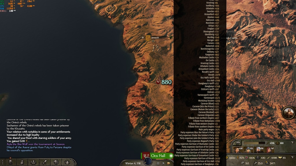
Example:
 CURRENT DESIGN:
Solution:
Either align them side by side
Or (not recommended)
Workshops Towns Parties
Caravan Castles
AND/OR (recommended)
Make a UI screen (in addition to the recommended solution), where you can see all finances. (maybe can be accessed by pressing the total in the Clan screen)
Its very annoying not to see. Ok, we get the total, but I want to see some more details of the spending in one spot (the tooltip makes sense if its laid out properly)
When you have many cities, caravans, and workshops, it becomes impossible to see all the finances (many of them get cut out).
Example:
| Workshop |
| Caravan |
| Town |
| Parties |
| Castle |
| Garrison |
| Etc. |
Solution:
Either align them side by side
| Workshops | Caravans | Towns | Castle | Parties |
| $$$ | $$ | $$ | $$ | $ |
| $$ | $$ | $$ | $$ | $ |
| $$ | $$ | $$ | $$ | $ |
Or (not recommended)
Workshops Towns Parties
Caravan Castles
| Workshops/Caravan | Towns/Castle | Parties | |
| $ | $ | $ | |
| $ | $ | $ | |
| $ | $ | $ | |
| $ | $ | $ |
AND/OR (recommended)
Make a UI screen (in addition to the recommended solution), where you can see all finances. (maybe can be accessed by pressing the total in the Clan screen)
Its very annoying not to see. Ok, we get the total, but I want to see some more details of the spending in one spot (the tooltip makes sense if its laid out properly)


