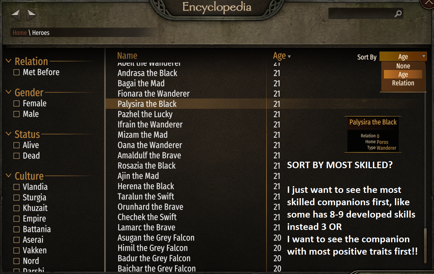
"Most skilled" is a relative term. One hero might be 200 in one skill and below 20 in others. And one guy might be 70 across the board. Generic "level" might help you better. But I also have some reservations adding a "level" sort since this page shows lords AND wanderers. I'll bring it up internally.
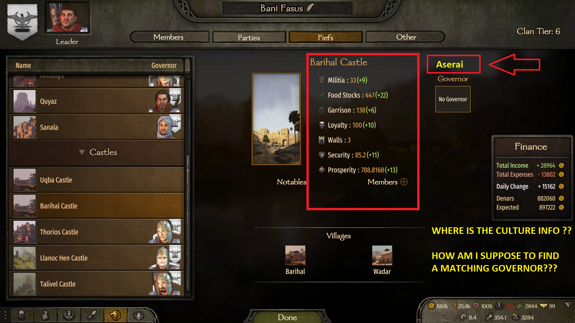
Culture info there is not relevant in my opinion. If it's affecting loyalty, prosperity etc. it's denoted in the tooltip of these values already. Seems unnecessary, plus the image of the settlement already gives you some idea. When it's relevant in the governor assignment, it should be shown there.
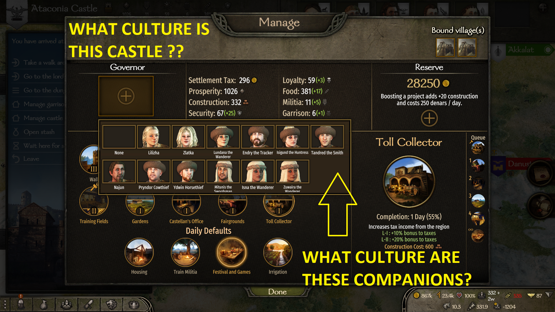
The governor effect of mismatching cultures should be denoted in the tooltip under governor effects.
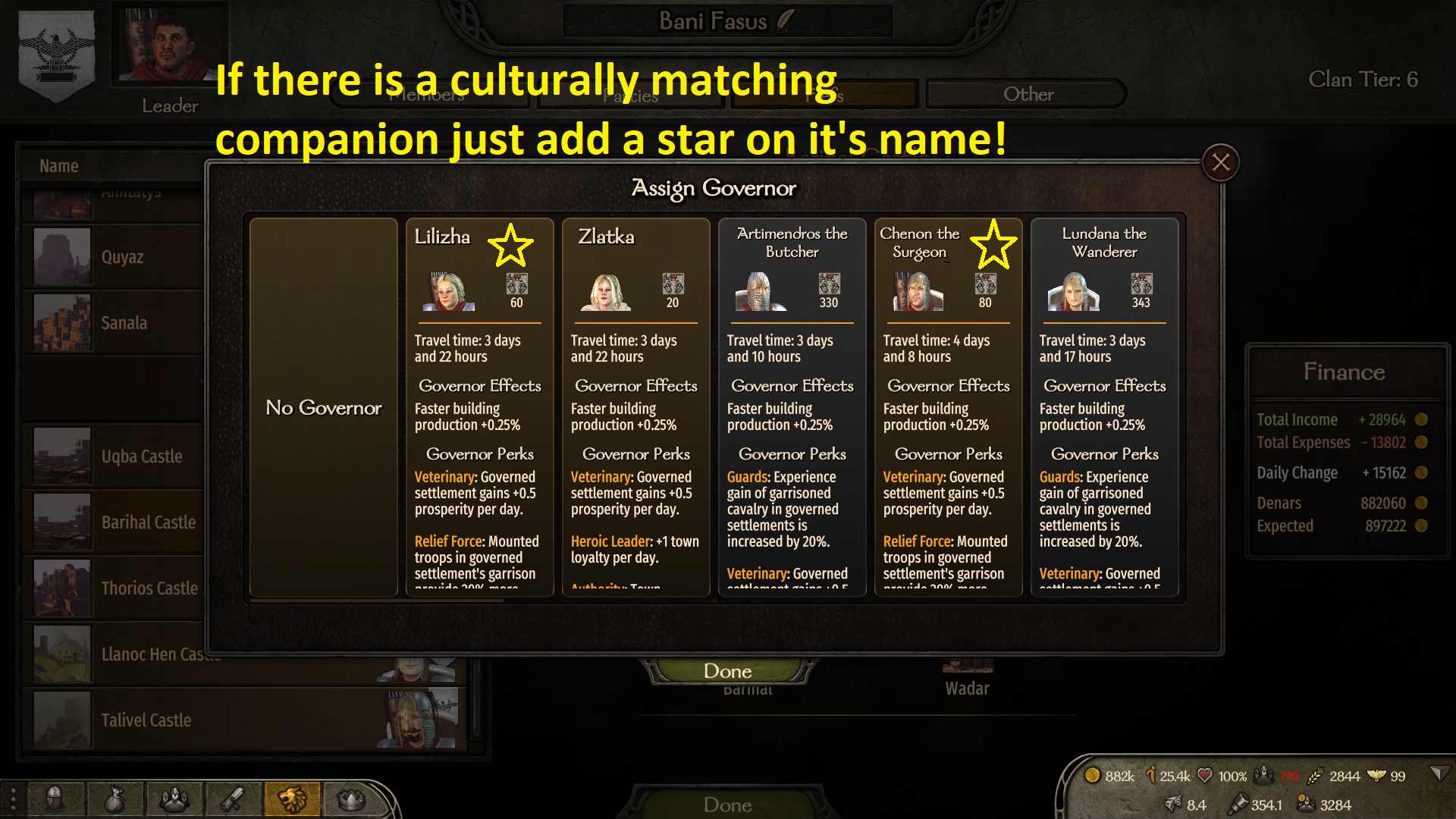
I think "Star" doesn't really solve the issue of "will this assignment give me culture buff/debuff". Players won't be able to understand it clearly and what it does. We also use "stars" for bookmarking already and that would be misappropriating iconography. Another entry in "Governor Effects" seems like a better solution.
I have taken some notes, will bring it up internally.