This is a cross post. I thought it deserves a seperate suggestion here, to make it ... better organized. 
Edit: Even though I still like the idea of more color coding in the perk tree, I realized that the govenor perks are not directly related with steward skills, they are just one of many roles associated with perks. More about that at the bottom of this post.
I am currently playing in 1.5.6 and after seeing the changes to settlements, especially loyalty I felt the need to delve a little bit deeper into the goveneur perks.
I had to realize that finding the right perks is pretty hard because many perks affecting governors are scattered all over the place, especially security and loyalty bonuses.
My suggestion would be to organize these exiled perks better. Imo steward should be the main governor tree, but I can understand why there are extra perks sprinkled here and there for flavor. It makes sense to allow a high charm or hero skilled in trade to have bonuses governing a town.
I think these perks should be highlighted better to make them easier to find, and in addition their placement should be less random.
I suggest one bonus perk at maybe Tier 2 (see polearm example below) and one at t8. This makes it also easier for people with color blindness to find them.
Here are some example pictures how additional color coding could work:
Color code assigned to Steward (green), and other skills:

Color hint added to t2 Polearm perk icon:

Edit:
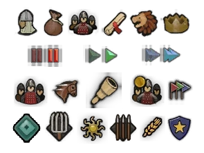
Instead of a colored line, I can also imagine a simple pictogram version working. I just realized most perks are less associated with skills, they are rather seperated into roles:
 Personal,
 Governor,
 Party Leader,
 Clan Leader,
 Quartermaster,
& Party Member, Scout, Surgeon, Army Commander, Captain.
Example:

Edit: Even though I still like the idea of more color coding in the perk tree, I realized that the govenor perks are not directly related with steward skills, they are just one of many roles associated with perks. More about that at the bottom of this post.
I am currently playing in 1.5.6 and after seeing the changes to settlements, especially loyalty I felt the need to delve a little bit deeper into the goveneur perks.
I had to realize that finding the right perks is pretty hard because many perks affecting governors are scattered all over the place, especially security and loyalty bonuses.
My suggestion would be to organize these exiled perks better. Imo steward should be the main governor tree, but I can understand why there are extra perks sprinkled here and there for flavor. It makes sense to allow a high charm or hero skilled in trade to have bonuses governing a town.
I think these perks should be highlighted better to make them easier to find, and in addition their placement should be less random.
I suggest one bonus perk at maybe Tier 2 (see polearm example below) and one at t8. This makes it also easier for people with color blindness to find them.
Here are some example pictures how additional color coding could work:
Color code assigned to Steward (green), and other skills:
Color hint added to t2 Polearm perk icon:
Edit:
Instead of a colored line, I can also imagine a simple pictogram version working. I just realized most perks are less associated with skills, they are rather seperated into roles:
& Party Member, Scout, Surgeon, Army Commander, Captain.
Example:
Last edited: