Bannerlord is way to colorful!

Users who are viewing this thread

WOW this looks stunning! Good job. I hope this will be in Native with an future patch^^
No it wont because players who are not into immersion / historical accuracy wont be able to tell which troops are friendly and which are their allies. It would be too "confusing". Its same logic like MTW2 and purple byzantine armies (purple color was more precious than gold back in the day).
 
No it wont because players who are not into immersion / historical accuracy wont be able to tell which troops are friendly and which are their allies. It would be too "confusing". Its same logic like MTW2 and purple byzantine armies (purple color was more precious than gold back in the day).
This is the reasoning yes. Warband amassed a cult following when every lord had a different banner. There was no mass confusion. They still changed it. Now i just feel like im playing age of empires
 
Because most people played with those giant glowing circles turned on.
I had no problems with the circles, but I understand its not for everyone. It would be the best compromise to add a third colour to the banners, keep the armies colour coded but have several tones of each colour so the units arent all the same like someone previously did in a mod
 
I feel like the skies and the distant 'backgrounds' in scenes are quite a big part of what might make it feel too light or slightly unrealistic somehow.
Look at the skies and landscapes in this for example (not saying it should be exactly the same or even as detailed):


Often there are sun shafts and stuff but no sun, elements outside the red barrier in the distance just look blatantly unfinished or of much lower quality, clouds can be missing or are static. Things that don't necessarily look bad but just not done. I'm hoping the overhauled battlefields will be more complete. Of course different types of weather would make a big difference too, rain, fog, wind, moving clouds etc.
There are same scenes with mist and it adds so much atmosphere.

Doesn't need to look more 'medieval' just more varied and realistic.
I had no problems with the circles, but I understand its not for everyone. It would be the best compromise to add a third colour to the banners, keep the armies colour coded but have several tones of each colour so the units arent all the same like someone previously did in a mod
Could also just have an optional hotkey for the circles.
 
Actually there is a option in the gameplay settings to disable the icons.
Yeah, not a hotkey. To enable or change the opacity you need to pause and go into the settings. With a hotkey you could just press it for a second to make the circle appear
 
Yeah, not a hotkey. To enable or change the opacity you need to pause and go into the settings. With a hotkey you could just press it for a second to make the circle appear
This needs to be added in native! Its a huge QoL improvment.
 
Wait a second...what giant glowing circles? You mean the rim circle things around the avatars?
During battles, the green circles over their heads, around the banners. Not immersive in the slightest but it allowed you to see who was on your side at a glance.
 
During battles, the green circles over their heads, around the banners. Not immersive in the slightest but it allowed you to see who was on your side at a glance.

Ah, okay. I thought you meant literal giant circles, thought I had taken a crazy pill or something, and just completely blocked it out. lol
 
Because most people played with those giant glowing circles turned on.
I still play with them turned on. I can't see well without them and prefer the combat awareness it affords to the more realistic look of not having them.

If combat was a hodgepodge of multiple colors everywhere and no banners or circles over their heads I wouldn't know wtf was going on lol.
 
Last edited:
The op is not wrong but he is not entirely right. So is Askorti, not wrong but not right. The basic problem comes down to a couple of factors:

1. In the summer, there is never rain. In the autumn, there is never fog. No storms exist either. It is never cloudy except in winter. So for the 3 out of 4 seasons there is constant sunshine. It also bothers me, but Ill be patient until they add weather. We had several threads pointing this out already, none of them answered by the devs.

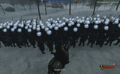
2. The banners are tacky. The colours are indeed too bright for anything that could be considered realistic or even just pleasant to the eye. I mean having 1 sigil and 2 colours is an abomination, but coupled with uniformed Age of Empires-looking soldiers it just hits extra wrong. As you could notice, soldiers in Custom Battle use an older system of banner generation, which has a tertiary color slot, more sigils, shield divisions etc. It is more pleasant and toned down than the company logos we have now.

3. Every item is coloured in the same colour as the banner. So imagine you have a red banner. Wear a scarf? Red. Tunic? Also red. Your soldiers? All red. Shield? Red. It is just ugly
This is exactly what is lacking in the current BL. Hopefully, they all get resolved by TaleWorlds. But it looks like TaleWorlds is still focusing on game mechanisms, not graphics/art styles.
 
I have to say that the look of the game has been excellent to me with very little faults (like a lack of hairstyles). I prefer the colors just as they are and have been since early access. This reminds me of the old argument back in the day with old console, Nintendo was too colorful and for some reason some people preferred Sega's lack of color. Tale Worlds has done a great job with the art work of the game whether it be the characters, the architecture, the 2d art and everything else. I constantly take screenshots of the game because of the look of the game. Using some ENB mod could work for those that prefer de-saturated colors.
 
Back
Top Bottom