Community Art ! [first post depository]

Users who are viewing this thread

thank you guys for valuation  :!:

Thomas Caravard said:
I see you've even added some artist's tweaks: these guys behind the Rus dude are throwing crossaints/boomerangs at the Viking. Great, it adds even more realism to the scene!
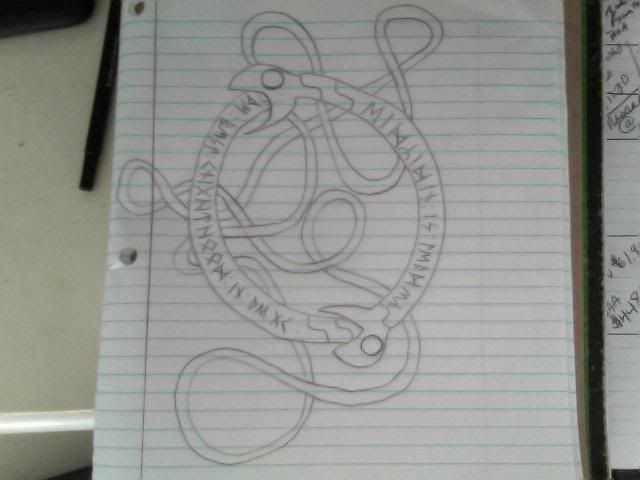
Originally these were meant to be war hawks, but croissants could work well either  :grin:

Now I even thought about a short poem about loner viking and his loyal friend, the battle cat who crushed whole rus army together!!! facing deadly croissants and rotten spears, nothing could match these two heroes. :grin:
 
Working on this piece some time now. Want it dark and gritty with some abstract elements, still much to do though.
Left helmet is photo reference, right helmet is giving me a headache.  :grin:

warriorse.jpg

I still need to learn much about the process of putting certain brushes in before getting it in shape..  :???:
 
Ah that looks really nice indeed  :eek:

The spear tip looks a bit bleak yet, although its of course unfinished yet.. if you wonder what shapes would suit it well, I found this old compilation of viking age spears by dejawolf, which just happen to be used in Vikingr as well^^

spears.jpg
 
weroper.GX said:
Working on this piece some time now. Want it dark and gritty with some abstract elements, still much to do though.
Left helmet is photo reference, right helmet is giving me a headache.  :grin:

warriorse.jpg

I still need to learn much about the process of putting certain brushes in before getting it in shape..  :???:
Sweeeet.
 
Moeckerkalfie said:
Ah that looks really nice indeed  :eek:

Thanks! I try and give the spears that look - only thing that bothers me at the moment is that the background is more detailed than the foreground.

FrisianDude said:

Thanks! :smile:

brognar said:
9jeg4w.jpg
Drew this a few years back before I knew anything about anatomy

I lol'd. Actually it is a masterpiece because the berserkr theme you tried to do is perfectly resembled.
 
brognar said:
...
Drew this a few years back before I knew anything about anatomy

Anatomy is just fine for that style and great choice of color scheme. Sometime quick silly sketches come out to be much better than any attempt to redraw em properly. I should save dat.
 
Wow, haven't seen this thread...! Can we have the blond chick holding the horse as loading screen for the next patch...?!? I guess we could have many more players with it...!!!!  :razz:
 
Ha :grin:! really glad to see this thread alive, to see that others joined their art

Halvar said:
Wow, haven't seen this thread...! Can we have the blond chick holding the horse as loading screen for the next patch...?!? I guess we could have many more players with it...!!!!  :razz:
in fact, there were told few words over optional menu screens or few screens changing every time you start game... will see how the situation evolve because as it seems, there are more fantastic pictures we may use on the way. Also my artsy friend asked me if there is need for some more loading pictures :smile:. There is just sad fact, that picture will be stretched on every screen resolution except the one it is made for.

brognar said:
9jeg4w.jpg
Drew this a few years back before I knew anything about anatomy
really moving piece  :shock:
I am almost sure this is the viking crushing Rus army, alongside with equally deadly cat...

STARik also already made a name for him as I see :smile: lets call him "Dovabeeard... the dragonbearded"


The best knighthood in the GK, Eidridin is leader.  :cool:

It's definitely the Elder Futhark. You are using the Z/R rune as a regular r though - this is wrong, it was only used in the ending of words/names.

Cheers!
 
Yep, I have absolute no idea what the grammar was like, or what letters to use.

So instead for my second drawing, I used the Latin Futhark alphabet, and used an English to Old Norse translator. Basically I translate words from English to Old Norse, and then write them down in the most recent Futhark format.
 
Aw, I would encourage you to keep using the Elder version, which I consider the richest - Don't mind grammar, you are writing English here anyway. Writing in Old Norse is hard indeed, and I don't like the "runification" of the Latin alphabet - it's silly (imo.)
 
skvor said:
new version is here, now in handy wallpaper pack. I did everything that was suggested (not only on this page) and made it even more epic... or at least I hope so.


preview:
valkyrie1440x900vikingr.jpg
wallpaper pack:
http://www.megaupload.com/?d=MMM2NGYO

oh and I had a little fun with idea of Caradoc Mòr :grin: His picture is fantastic, I just tried to rework it slightly.
vikingvsbraverus.jpg

Just wanted to say that my desktop has never looked better  :grin:
 
Dansk viking said:
Aw, I would encourage you to keep using the Elder version, which I consider the richest - Don't mind grammar, you are writing English here anyway. Writing in Old Norse is hard indeed, and I don't like the "runification" of the Latin alphabet - it's silly (imo.)
Eh, sure. But the Elder Futhark doesnt have all the letter in the English alphabet.
 
ok I found little time and taste for quick character concept. This should be UI illustration for basic viking infantry. It has the original equipment

It is not super duper so tell me what do you feel should be changed or any ideas...

basicviking.jpg
 
Back
Top Bottom